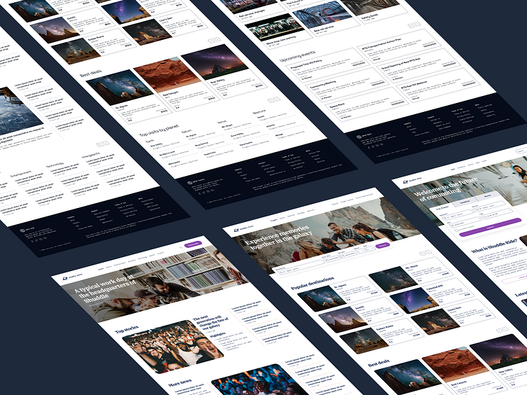
Shuddle: Design Systems
Background
This is a fictional project for Dribbble's Design Systems course.
There are 2 phases for this project. Phase 1 was released a week before Phase 2.
Overview
Phase 1
As Head of Digital for the newly launched IPTS: the Interplanetary Travel Syndicate, a bustling transportation network that shuttles people from world to world within our galaxy, leadership has decided to launch with 3 unique offerings, which are:
ipts.org, an informational website where you can find the latest news and happenings with the IPTS
IPTS Travel, a website where you can browse and book travel to and from multiple destinations within our galaxy.
IPTS Rail, a real-time updated web app where you can view lines, routes, and times for all the different commuter lines.
Each website has to be at least 1 page, but each page has to have at least 5 components on it. A design system will likely help with this effort.
Chronicling along the way and making a reference site for the design system would help the next person who has to launch these three products know exactly how to do it.
Phase 2
Leadership at the IPTS—the Interplanetary Travel Syndicate—just hired the prestigious branding firm MegaBrand to do a rebrand of the entire organization, and there are a few things that’ll affect the three products.
MegaBrand discovered through focus groups that the IPTS name and logo felt very ominous, like it was cold, faceless corporation that was always watching.
In addition, the IPTS wants to appeal to a younger demographic.
After weeks of research and exploration, they’ve settled on the new name “Shuddle,” which feels more like a cool, new startup.
Process and Deliverables
Phase 1
Competitor Analysis
Styles
Visual Design
Components
Reference Site
Phase 2
Styles
Components
Visual Design
Reference Site
PHASE 1
Competitor Analysis
Since I had to design 3 unique website products, it made sense to start off with analyzing competitors for inspiration across 3 categories: News, Travel, and Commuter. Although I took some screenshots from different competitors, I still referenced some of them by revisiting their sites. Due to the scope and time for this project, I decided to analyze and design landing pages only.
News
I focused on finding which layouts of how content is presented that I thought were visually engaging. Considered factors were varied type size and layout.
Travel
I looked at input fields where user searches for a destination, and cards showing destinations. Specifically, I took note of what and how content is presented.
Commuter
I explored what features and sections are shown for ideation. I noticed things like planning a trip, latest updates, and upcoming events.
Styles
Color, typography, and grid were setup in advance to save time and cover what I needed for my design.
Color
For simplicity, I decided to use a neutral palette only. Also, this thematically and logically works for a space related product. To create my palette, I copied Tailwind's Slate palette from their colors page. Every color is the same, except for the darkest one (1000), which was adjusted slightly.
Typography
For font, I chose Space Grotesk for headings and Space Mono for the rest since they seemed appropriate and fitting for a space related product. The scale setup is somewhat similar to how Material 2 Design approaches type scale.
Grid
Since I decided to design for desktop, I created a grid style for 1440px width with 64px margin and 32px gutter. Vertical spacing is 8px.
Visual Design
To determine what components to create for a design system of IPTS, I designed the landing pages for all 3 websites in high-fidelity from start to finish. The challenge was to design each page to be distinct from each other while also belonging together under the same ecosystem.
My design process was creating 1 section at a time from one page to another. For example, I started with headers across all pages, and then with hero sections in the same manner.
Components
After finishing the visual design, I was able to determine what components to create for the design system. The criteria was if something was repeated at least 3 times either on the same page or different pages, it should be a component. There were a couple of "deviations" to the rule, but were complex enough to justify the need for them to be components too. These were the destination picker for IPTS Travel and the rail menu for IPTS Rail.
After creating components, I replaced most of my design with instances of them.
Reference Site
To ensure designers can redesign any of these pages, I chronicled my process with a design system documentation tool called zeroheight.
Check out my reference site for the IPTS Design System. Each of the designed pages can be found under the "IPTS WEBSITES (ARCHIVE)" category.
PHASE 2
Styles
Color and typography were provided for the Shuddle rebrand.
Color
The color palette is fresh and vibrant.
Midnight replaced the darkest variations of neutral
White replaced Neutral 0
Marina was applied to text in the footer
Amethyst was the button color
Apricot was applied to divider lines
Typography
The typographic palette relies heavily on the IBM Plex superfamily (IBM Plex Serif and IBM Plex Mono) to both give a wide range as well as make everything feel familiar.
IBM Plex Serif replaced Space Grotesk for Headings and Subtitles
IBM Plex Mono replaced Space Mono for Body, Button, and Label
Components
Since visual design was completed for IPTS, components were applied with new color and typography. Corner radius was curved for specific components like cards as an example for rebranding purposes.
Visual Design
After changing styles and components, I redesigned all 3 website landing pages to reflect the Shuddle rebrand.
Logo was changed
Some images were swapped for photos of younger people to feel more welcoming and inviting
Some written content was edited
Reference Site
The same reference site has been updated with documentation pages for Shuddle websites. Check them out under "SHUDDLE WEBSITES" category.


