Hoka Website Redesign
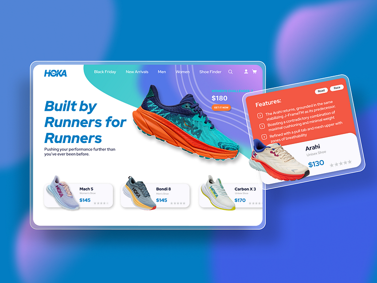
The aim for this landing page design was to showcase the versatility and uniqueness of these awesome running shoes (I am a fan myself ;) )
For customers looking for the perfect running shoe, mentioning features and benefits is a must, so I added some motion to the different styles of shoes and added a horizontal scroll to showcase other shoes in the range too.
To add a bit of a modern design I opted for a gradient (inspired by the colours of the other shoes in their range) whilst still incorporating the main logo colour in the gradient too.
If I had spent more time on this website, I would have liked to have added a parallax effect to the shoe on the hero image to add a bit of motion too, what do you think?
Thanks for viewing :)
Looking to bring your project to life?
Feel free to drop me a message on Dribbble or
email: info.deeparama@gmail.com
