Design System Case Study on Rebranding
The Context
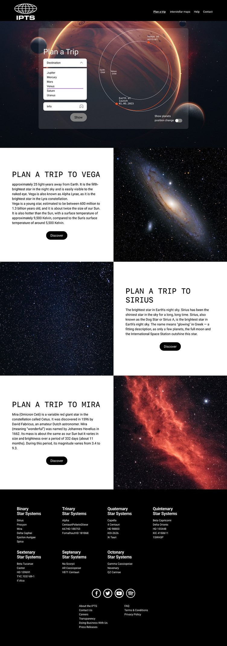
The case study is based on the capstone project of the Design Systems course with Dan Mall. I find myself in the hypothetical role of being the Head of Digital for the newly launched IPTS: the Interplanetary Travel Syndicate, a bustling transportation network that shuttles people from world to world within our galaxy.
Briefing
came with this logo that already defined a very specific mood.
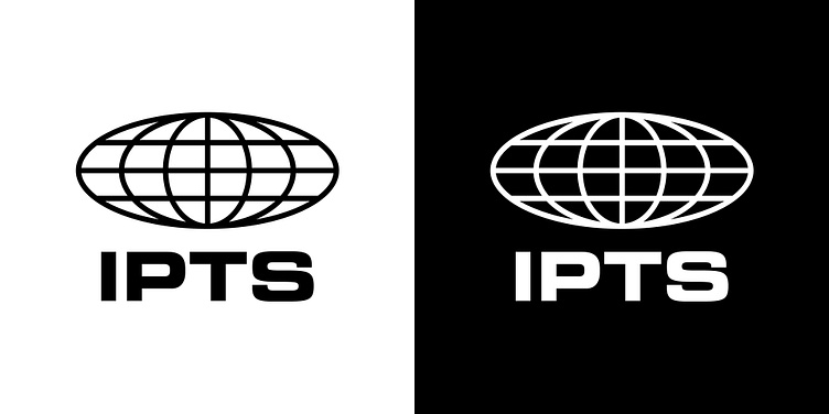
IPTS Logo light/dark
The Process
To begin with I started setting up a Zeroheight site. Directly in there I created a Notes and Observations Session to be used as a logbook and chronicle my Hot Potato approach and steps. In anticipation of continuing to use it as actual Design system documentation and Style-guides site.
Typography & Colors
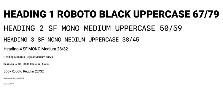
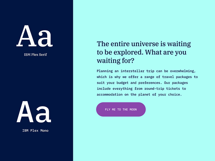
I proceeded by finding a mood. In the choice of typography I included mono space typography to give a kind of futuristic (actually retro) aesthetic.
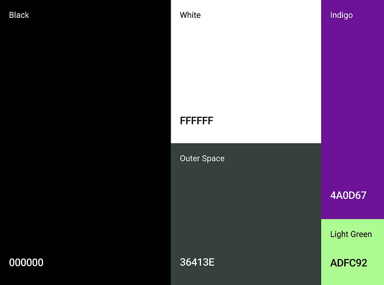
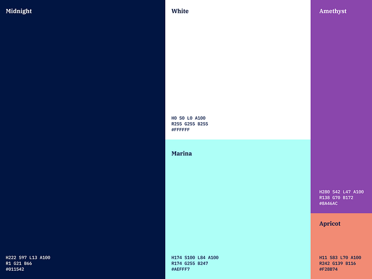
As for the colours, I played mainly with black and white to stick to the aesthetics suggested by the logo, with the addition of a few other colours to serve secondary and functional elements.
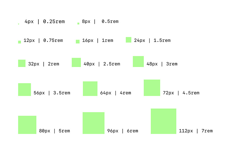
Spacings
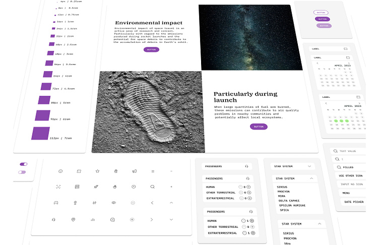
Components
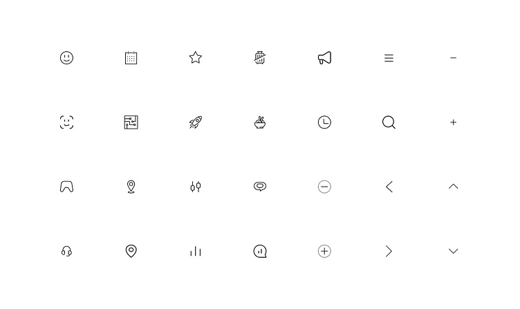
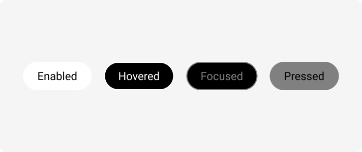
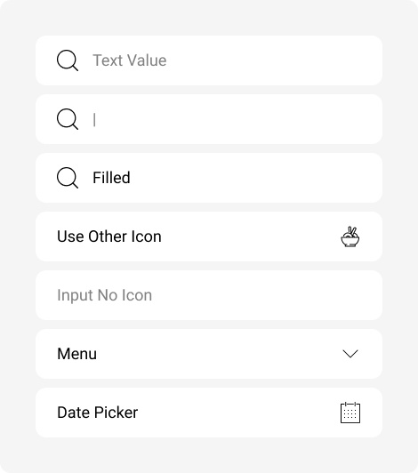
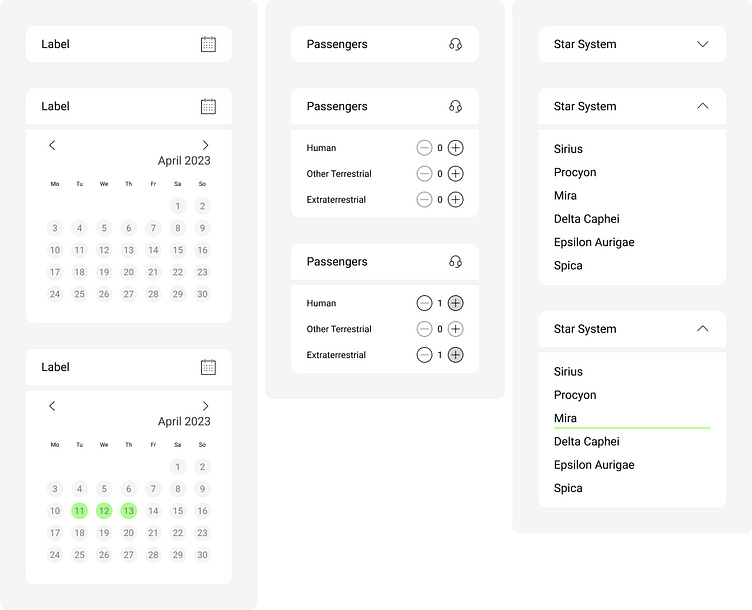
At this point, I identified the basic components that would serve the IPTS transportation network.
Usage
Initially the same design system fed the following three services.
ipts.org
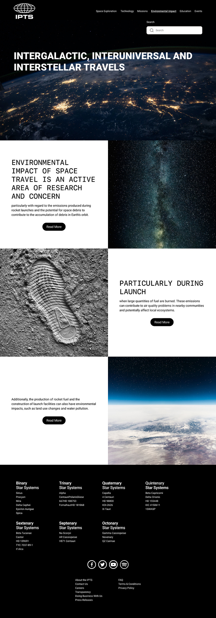
IPTS Travel
IPTS Rail
The real challenge
In Dan Mall's words, "Design systems prove their value most at the times of change."
The Interplanetary Travel Syndicate was rebranded. IPTS name and logo felt very ominous, like it was cold, faceless corporation. IPTS wants to appeal to a younger demographic.
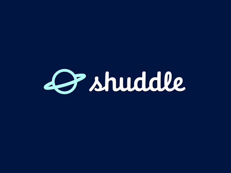
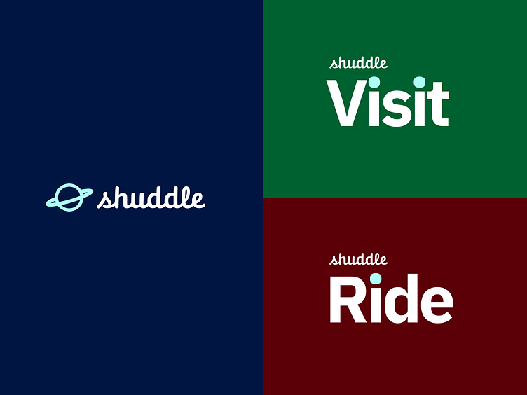
They settled on the new name “Shuddle,” which feels more like a cool, new startup.
The 3 main products have also been renamed to feel more like a family of products instead of independent offerings:
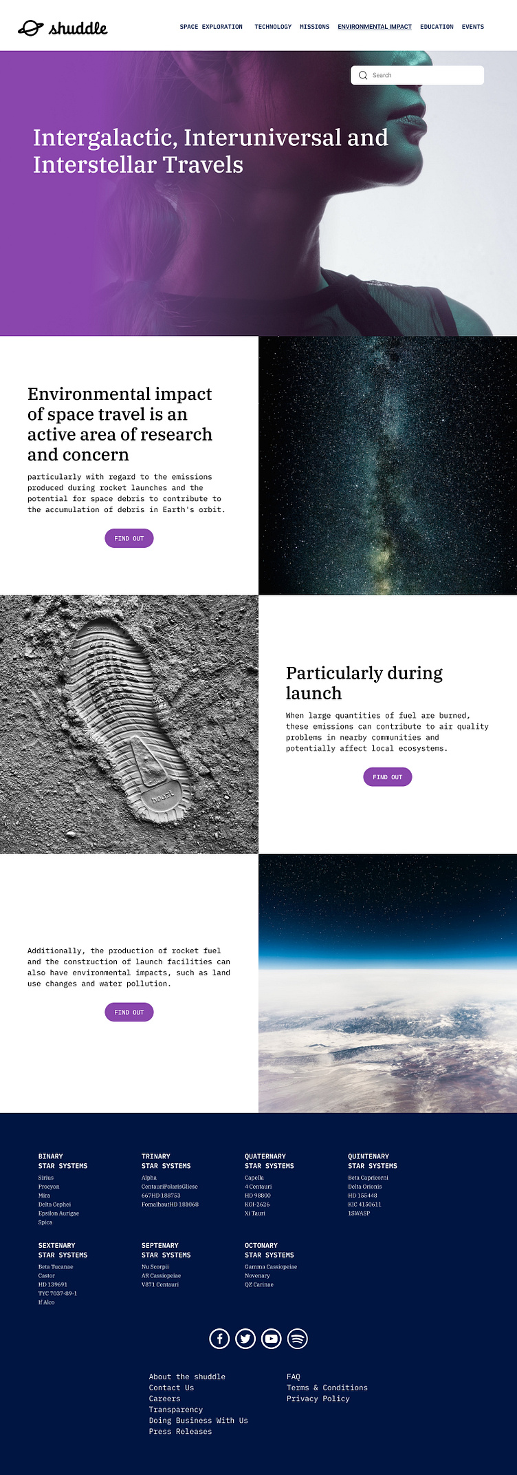
“ipts.org” is now “shuddle.world.“
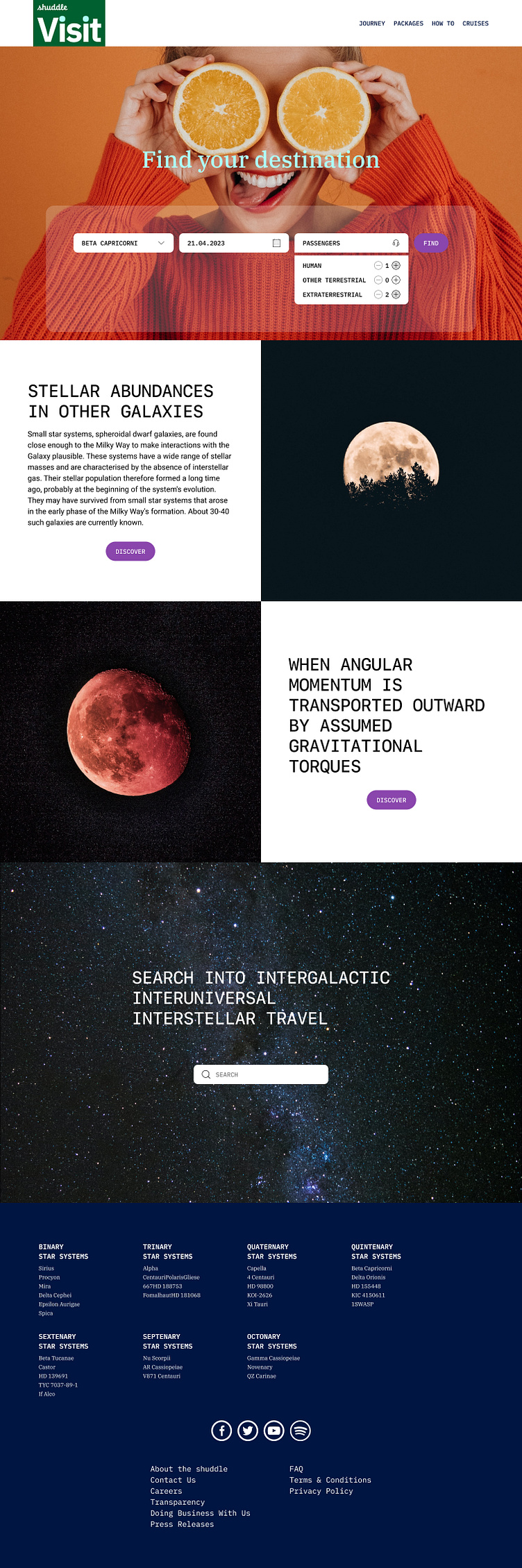
“IPTS Travel” is now “Shuddle Visit”
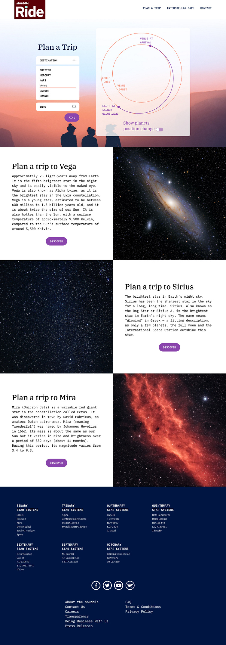
“IPTS Rail“ is now “Shuddle Ride“
Let's Go!
...
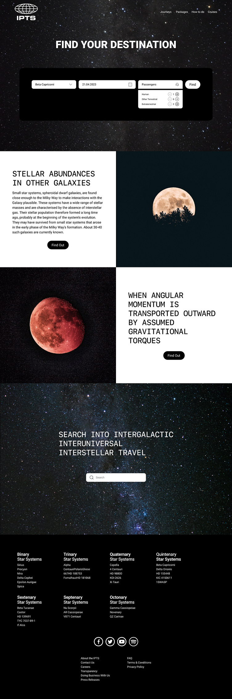
At first, the challenge seemed very big. It seemed like a completely different product. But then I thought, maybe I am already on the right track, since I had chosen a monospace as one of my typefaces. Actually for the Headlines and not for the Body.
Like in any transition one can always get lost in translation :)
I went ahead and powered by my Design System...
et voilà
Thanks to the use of a design system, it was relatively easy to first apply it to the three services and then tackle the major challenge of A Rebranding.