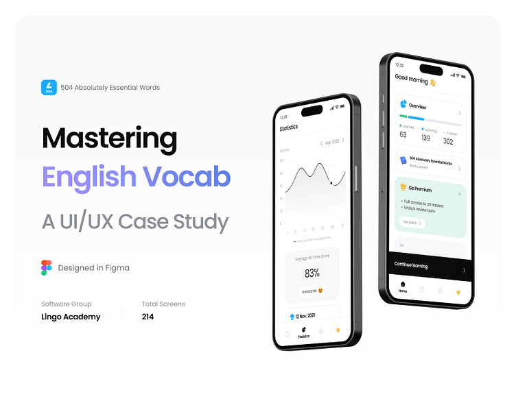
English Learning Application-A UI/UX Case Study
Hey everyone👋
I am pleased to present a detailed case study of a project I recently completed for both iOS and Android platforms. This study documents the design and optimization process I underwent to ensure a seamless user experience, and the creative solutions I implemented to overcome the challenges I encountered along the way.
Lingo Academy Vocabulary Learning is a free app for learning English vocabulary. It was created by Lingo Academy, an online school that teaches English as a second language.
When we set out to design this course, we had a few goals in mind. First and foremost, we wanted to create an engaging experience that would help you learn English vocabulary while having fun. We also wanted it to be easy-to-use so that anyone could pick up the app and start learning right away. Finally, we wanted this experience to be flexible enough so that it could be used by people who are brand new at learning English as well as those who have been studying for years!
Scroll down this case study with me, I've invested more hours into it than I care to admit - I might need therapy after this.
There are many people who try to expand their vocabulary and learn English by reading 504 Absolutely Essential Words. The majority of them, however, do not finish the book and leave it in the middle. The reasons for this can be motivational, being unengaged, having too little time or feeling as if they are not learning enough.
In order to solve this problem, we developed an application that uses the leitner method to help people learn new words. With those being said, let’s dive into our process and what we finally came up with.
Please let me know what you think about this file 😊
🟢 I'm available for new projects
Let's talk:
✉️ mohammadhadiahmadian1999@gmail.com
Follow me on


