Blue Federal Credit Union's Checking Page - Redesign
Redesigning Blue Federal Credit Union's Checking Page:
A Case Study in Enhancing User Experience and Increasing Conversions
Introduction
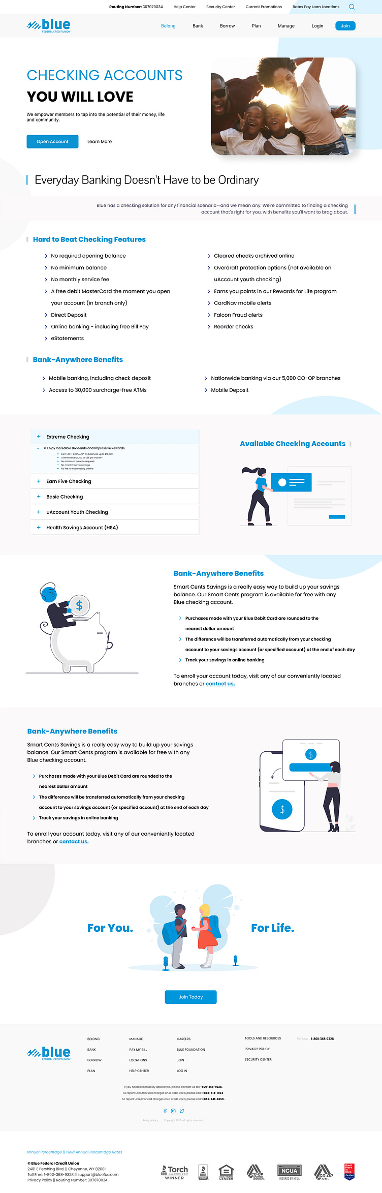
Blue Federal Credit Union, a well-established financial institution, faced challenges with low user engagement and conversions on their checking account page. Saif was entrusted with the responsibility of redesigning the page to improve user experience and boost conversions.
Problem
The initial checking page encountered multiple issues that negatively impacted user engagement and conversions:
Unclear value proposition: The page failed to effectively showcase the unique benefits of Blue Federal Credit Union's checking accounts.
Congested layout: The design obstructed users from quickly locating the information they sought.
Ineffective calls-to-action (CTAs): The CTAs were unappealing and didn't prompt users to take the desired action.
Poor mobile responsiveness: The page wasn't optimized for mobile devices, resulting in a suboptimal user experience for a substantial portion of visitors.
Solution
Saif implemented the following strategies to redesign the checking page:
Clarify the value proposition: A captivating headline and subheadline were crafted to clearly convey the advantages of Blue Federal Credit Union's checking accounts.
Streamline the layout: Content was restructured and white space utilized to establish a cleaner, more user-friendly design. This allowed users to navigate the page with ease and find the necessary information.
Optimize CTAs: More prominent and persuasive CTAs were designed to encourage users to open an account or explore the checking options further.
Improve mobile responsiveness: The page was fully optimized for mobile devices, ensuring a seamless user experience across all platforms.
Monitor and analyze performance: Analytics tools were employed to track user engagement, conversion rates, and other key performance indicators (KPIs) to gauge the success of the redesign.
Results
Following the redesign, Blue Federal Credit Union observed notable enhancements in user engagement and conversions:
Extended time spent on the page: The average time users spent on the redesigned checking page increased by 40%, signifying heightened engagement levels.
Decreased bounce rate: The page's bounce rate reduced by 25%, indicating that users were more inclined to explore the content and continue browsing the website.
Boosted conversion rate: The conversion rate for new checking account sign-ups rose by 35%, showcasing the efficacy of the revamped layout and optimized CTAs.
Refined mobile experience: Mobile users reported a superior overall experience on the redesigned page, contributing to the overall growth in engagement and conversions.
Conclusion
Saif's redesign of Blue Federal Credit Union's checking page effectively tackled the initial challenges, resulting in heightened user engagement and a better conversion rate.
This case study emphasizes the significance of a meticulously designed website in driving conversions and enhancing the overall user experience. By concentrating on clear communication, intuitive design, and optimized CTAs, Saif successfully crafted a more efficient and user-friendly page that yielded tangible results for Blue Federal Credit Union.
