Gaming UI Update

"The Ascent" UI Recreation
Let me introduce you to a game you should absolutely play - The Ascent, developed by Neon Giant (available on Xbox Game Pass). I absolutely love this game, even if some of the boss battles are brutally hard, like serious NG?!
But to be honest, the UI was an aspect I didn’t enjoy too much...
From the small text size to the low contrast ratio, I found my eyes fatiguing after 15 mins on average of each round of playtime. So, I opened up Adobe Xd and decided to recreate the main menu 💁🏼♂️
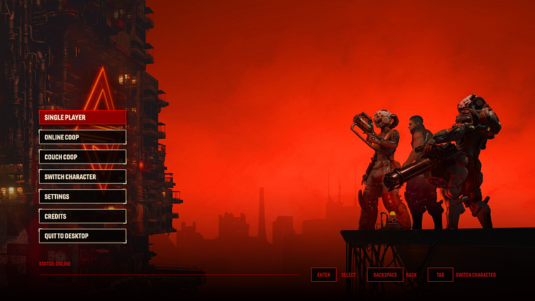
The idea was to challenge myself to recreate the menu from scratch and play around with the coloring to improve contrast. The all red variation (attached below) is a recreation of the current main menu from the game.
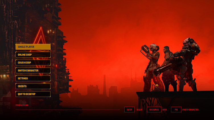
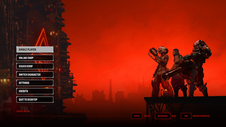
Since everything is heavy black and red, the menu options being black and red as well made the entire menu blend in and not stand out. 3 color alternatives were chosen but ultimately I think I like the tan/beige looking one the best (which is a color used lightly in the current game’s UI). By utilizing the beige, the contrast ratio triples and would vastly help visually impaired players that have difficulty distinguishing the dark red menu options that overlay the dark backgrounds.
To be fair, I can understand why Neon Giant devs went for this because the moment you launch the game, the red and black interface sets a very serious tone so the player knows what they are getting into.
Want to work together on a project? Shoot me a message :)
Taylor Rodriguez
Recreation of current main menu...
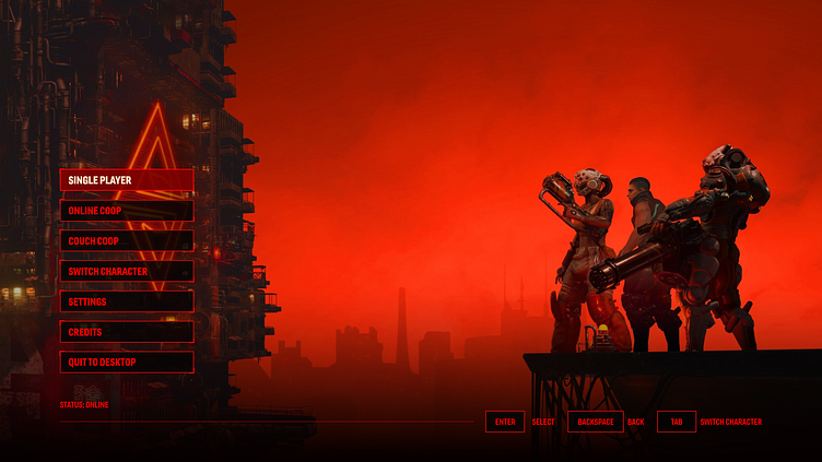
Other alternatives...
Want to collaborate?
Send me a message or visit my website, here.