Case Study: Celestial Design System
TLDR;
I created a design system to help me design three products for the same company. I used design tokens and structured components to prep for global changes. There were compromises on the system’s usability, so I compensated with better discoverability. I then rebranded the products to test the system. Being my own user taught me how to anchor my systemic decisions in principles and intuition.
Context
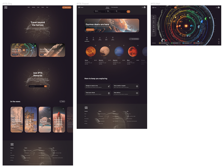
I learned new principles and processes for building robust design systems during Dribbble's Scaling Design Systems course. I applied these skills by creating my own system called Celestial, used to power three different products for IPTS (the fictional Inter Planetary Travel Syndicate).
My goal was to systemise smart and early, to focus on crafting a system that would allow me to iterate on the products using a coherent and consistent set of rules and tools.
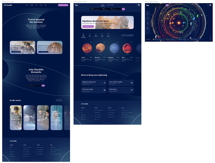
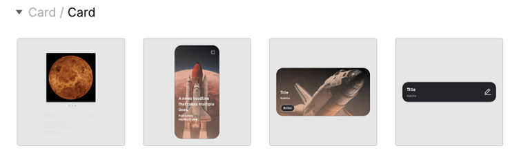
Wireframing the products
ChatGPT helped me kickstart the product design process, and Midjourney gave me some beautiful inter planetary imagery. I wireframed all products simultaneously, to identify where components could be re-purposed, and come up with a consistent brand.
Designing the system
Once the functionality was decided, and the styling about half-decided, I switched my focus to the system that would power all this.
I had run into issues in my past experience with design systems that I wanted to put to the test here. Systemic colours, naming conventions, and global structural changes, for example. I also wanted to learn my way around the Tokens Studio plugin.
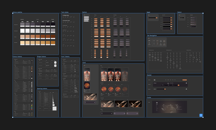
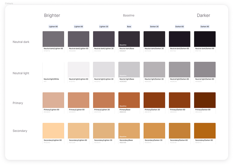
Scalable colours
Once I picked my primary and secondary brand colours, along with complementary neutrals, I used this colour shades generator to complete the palette. I manually adjusted it to ensure consistent tinting and shading across hues. The matrix increment of 30 gave me some space to add styles in-between, should I need to. I found the "darken" and "lighten" to be the most intuitive nomenclature to play with from the Design panel.
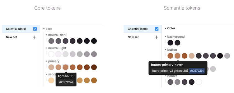
Core tokens
The Tokens Studio plugin enabled me to use these as core tokens, nested within semantic tokens. If the primary brand colour needs to change, all my primary buttons and their states inherit the new colour in the right shade or tint, without the need to change the tokens - only the core, which may be used across multiple tokens.
Naming is structuring
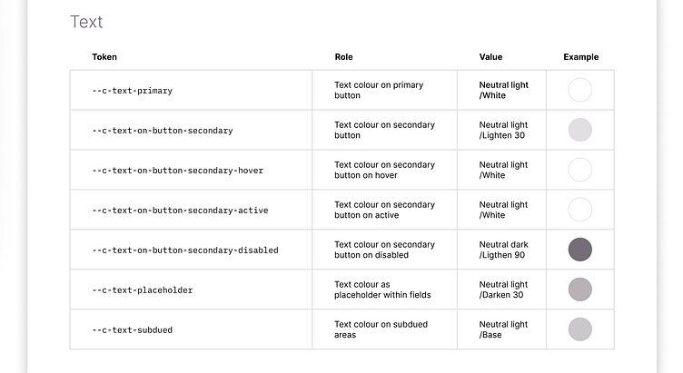
Researching other teams’ naming conventions showed they are a product of discussion, a crowd-sourced set of decisions. “For this button label, should we use $text- or $button-?” or “Should we go global or semantic here?”. The team ought to decide based on its average mental model, then test with external users. For Celestial, I kept all prefixes to indicate the element this token is for, avoiding --c-button-primary-text, but using the infix --c-text-on-primary. I decided on semantic naming due to the simplicity of the products, conscious that some duplication is a downside, and clarity of use a great advantage.
Team communication and testing is key to know whether this is usable at scale. For the time being, I relied on findings from Lukas Opperman's article Naming Design Tokens in UX Collective.
2 is a coincidence, 3 is a system
To keep Celestial useful and maintainable, I systemised a component only if it appeared three or more times. Consistent naming conventions and clean in-component layering proved to be the most important parts to enable intuitive property setting.
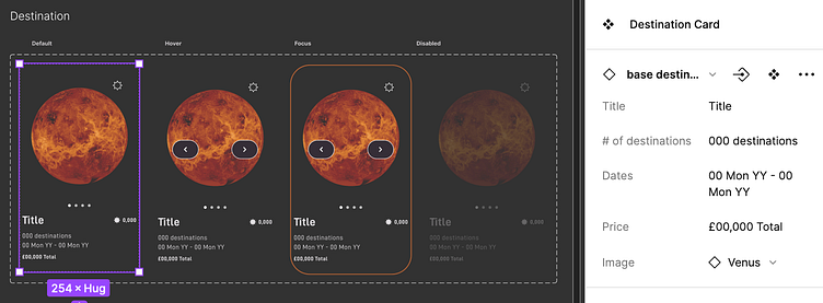
Base vs. published components
I wanted to make it as efficient as possible to update the structure of components globally. This meant the need for a root “base” component nested within each published component, that I would hide when publishing the library. This way, my 96 buttons’ border radius could be updated by modifying 3 base components. All structural tokens are applied to the base component, while all colour tokens are applied to the published component and its states.
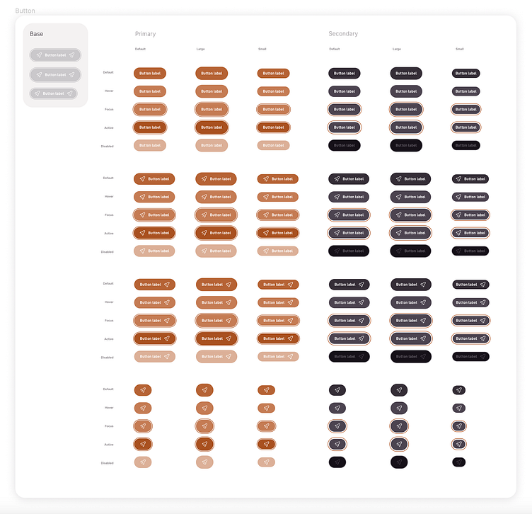
Easier to update > easier to use
The downside of the base component is more clicks for the user of the system. When updating properties on the Design panel, there are two sets of properties: one on the component (component’s state, e.g. hovered), and one on the base component (component’s content, e.g. image instance). The designer has to click into the base component to reveal the second set of properties to update.
Discoverability > usability
To compensate for the downside in usability, I paid close attention to component discoverability. Instead of creating a wide component set for the card that only appears as one type on the Assets panel, I created a component set for each variant so they are not hidden behind the Type property.
Outcome
Finalising an interface by drag & dropping 80+% of its content is a wonderful experience. In my years as a product designer, my creative process has often gotten stretched between big picture and rethinking atoms. When the system is backed by foundational principles that tie it all together, it makes the designer more confident in focusing on innovation.
Being the user of my own system got me to test and freely iterate on my design decisions, making me long for a team to discuss them with. Yet having these conversations with myself got me to answer my own Why’s more deeply.
Validation
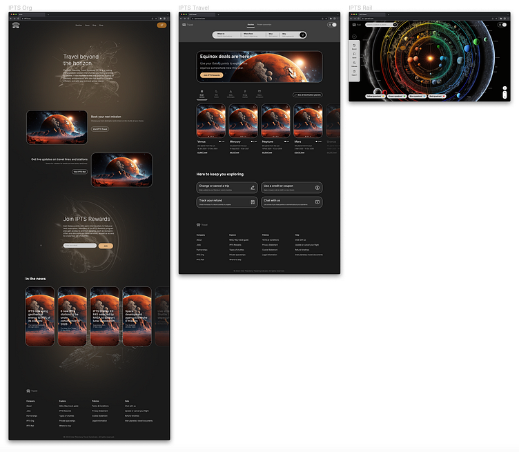
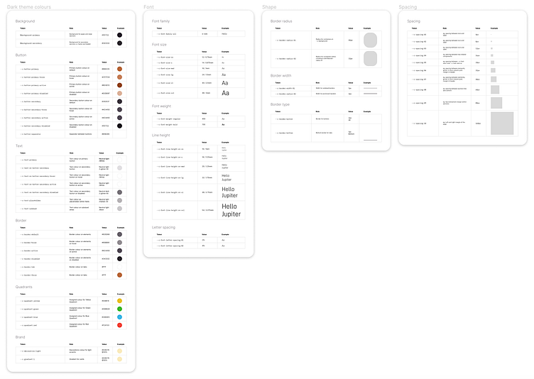
The system was put to the test when I implemented a rebrand. The change of the primary font and the addition of a secondary font meant a rethink in the typography system, but thanks to the --c-font-family- token, it was quick. The new colour palette only had me update the core tokens, which my semantic tokens and components inherited. The few manual updates and corrections left to make were a fraction of how long this would have taken, had it not all been beautifully systemised.
The rebrand revealed some detached elements, and the accidental application of core tokens directly to components. These don’t cause issues when products are simple and structures don’t change, but for next time I know how to polish my process so as to not take accidental shortcuts.