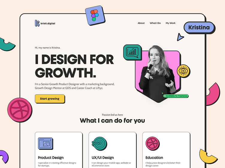
Personal Website Redesign for a Product Designer | NeoBrutalism
Context
With all the changes in my career and new personal goals, I realized it was time to freshen up my website (kristi.digital). I originally designed it in Figma back in 2019 and brought it to life with Webflow in 2020.
So, armed with a fresh perspective and a mug of strong coffee ☕, I dove headfirst into creating a brand new design in 2023.
Challenge: Your Friendly Mentor
Ever since I started mentoring UI & Product Design at Dribbble, I've been searching for a website that's more approachable and engaging. My aim was to create a friendly and inviting space, particularly for junior designers and anyone looking for a mentor to guide them along their career path.
Neo Brutalism Inspiration
When I was teaching the Dribbble UI Course, I wanted to find some inspiration to share with my students. So, I put together a moodboard that became my starting point in this project.
That's when I stumbled upon a design trend called Neo Brutalism (or Neobrutalism). This style is all about bold modern typography, simple shapes, and hard contrasts, and it avoids gradients in favour of bright colours, dark outlines and hard shadows. In other words, it's like the Chuck Norris of design trends - bold, tough, and doesn't take any crap from gradients. 😅
And let me tell you, I fell in love with it!
Simplified Design Process
Design process? More like design chaos! 😅 But, in all seriousness, I was able to keep things pretty streamlined with this project since it was all mine.
I started by defining my core typography and colour scheme - and you won't believe where I got my colour palette from. It turns out that Dribbble UI Course tasks are great for playing with tons of colours. Who knew that teaching others could be so rewarding?
Choosing Typography
When it came to choosing the right typography, I had a tough time. I even considered buying a fancy option. But then, I found Work Sans by Google Fonts and decided to give it a try.
I really loved how it looked - it was bold and wide without being too much. It’s not too wide compared to Clash Display (on the bottom left) but still wider & more modern than Neue Haas Grotesk (at the top). Work Sans (on the right) was the perfect choice for me.
*Update: recently I bought Unigeo32 by Zetafonts for my titles. I just could not resist its "g" shape and retro vibe.
Once I had my hero section sorted out, the rest of the page came together like magic. I focused on highlighting the three key services I plan to provide, and I even made some colourful icons to make them stand out.
Personal branding
And let's not forget about personal branding! I mean, who doesn't love a little consistency in their lives?
So, I set to work on crafting some different profile pics, background images, and cover images that all captured the same vibe and feel I was going for. I even threw in some random colourful shapes to make them pop.
💅 Design System
You know me - I wouldn't be myself if I didn't create a simple design system for my website. Plus, since I was building it in Webflow, I wanted to keep things super streamlined by planning ahead and simplifying class naming.
🥳 Live website
I'm pretty proud to say that I managed to redesign my site in just a week. Want to know my secret? It's simple - I'm passionate about neo brutalism and all things design-related. Plus, Figma's auto-layouts and proper design system helped me out. And, of course, the fact that I already had a solid foundation built in Webflow (with my old website) didn't hurt either.
If you want to check out my new site, just head on over to kristi.digital!
__________
🎓 Learn design with me: Dribbble UI Design Course & Product Design Academy
Follow me on my 📸 personal or 👩💻 professional Instagram.
Or visit my website to learn more about me.


