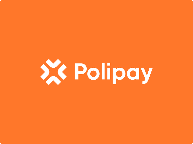
Polipay - Branding for digital payment platform
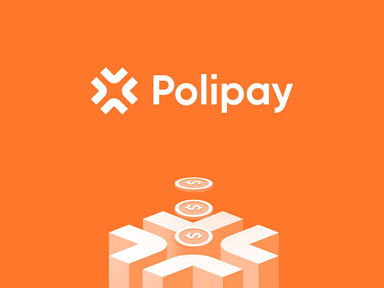
Polipay is a new level of payment platform on blockchain technology that works with basically all global non-sanctioned banks and makes international payments fast, simple, and easy for any user with low commissions.
Let's take a closer look at the logo, colors, and additional attributes of this brand identity 👇
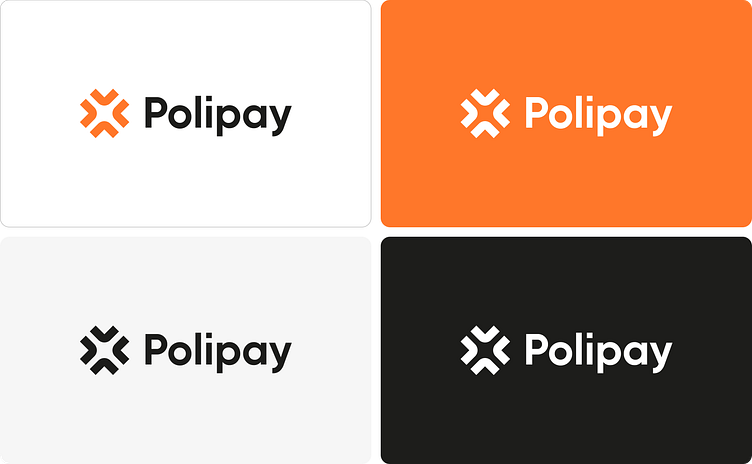
Logo design
We took into consideration that the logo should be meaningful and portray the essence of what the payment platform stands for.
There were many iterations and we ended up with this specific variant.
The final logo conveys the meaning of the many ways in which finances flow, which eventually ends up at one point, which is our product and the client's target.
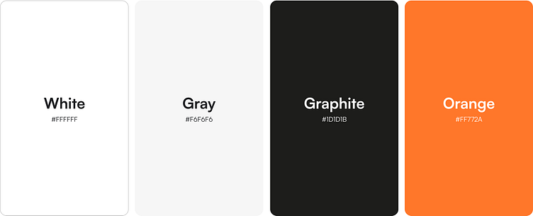
Color palette
The color palette is monochromatic, and the "conductor" is orange, which is designed to convey warmth and bliss.
It is always pleasing to the eye and promotes a good mood. It almost always has a positive effect because it shows the joyful aspects of life.
In psychotherapy, orange strengthens the will, and in our case, it strengthens the positive experience of using a financial services.

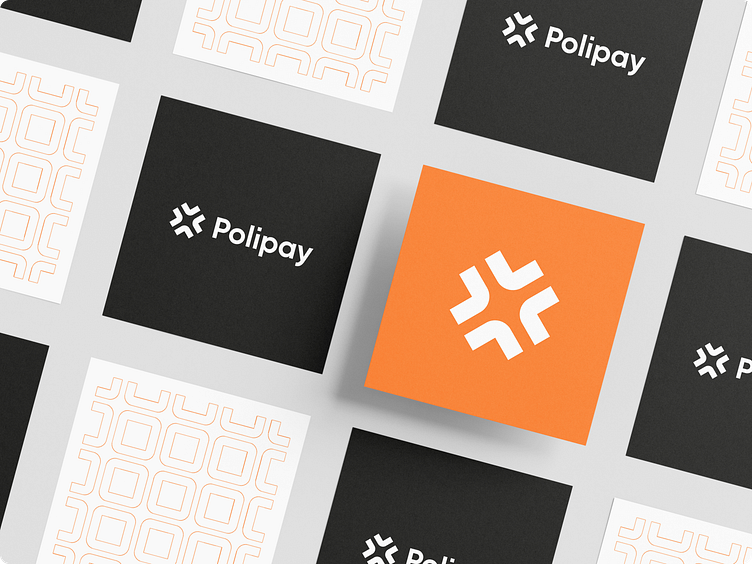

Additional attribute - the point of differentiation
Making a great logo and choosing nice appealing colors with typography isn't enough to uncover the actual essence of the brand.
To stand out even more in the market, attract attention and be remembered, you need to add a certain character to the brand and emphasize its authenticity.
To achieve this mission we came up with the idea to add an attribute of the brand's identity - illustrations.
That makes the overall image more vivid and reveals its deeper meanings.