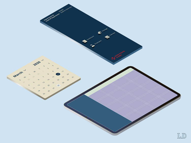
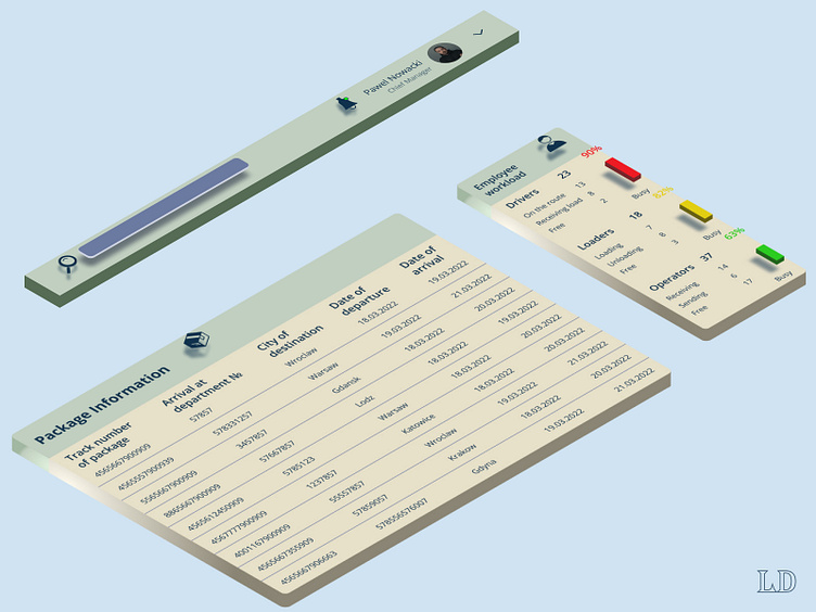
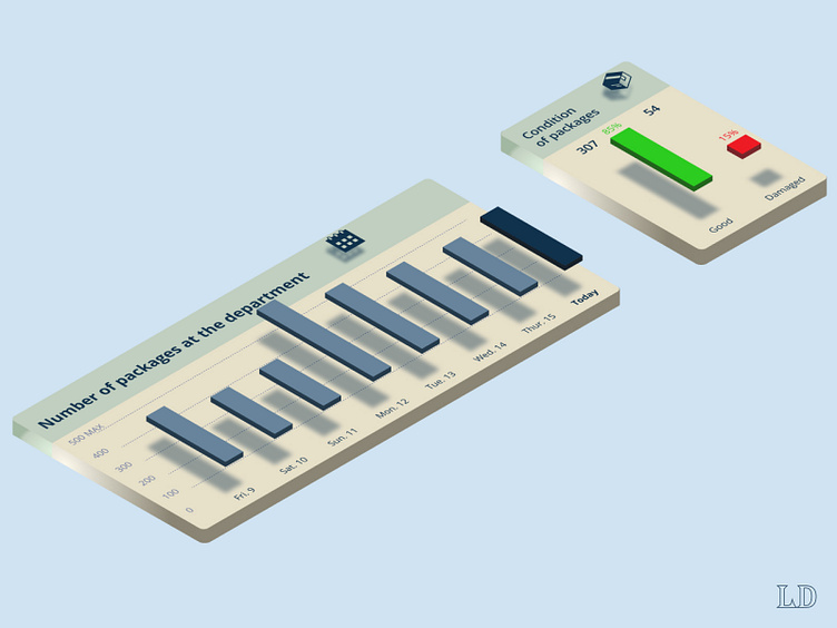
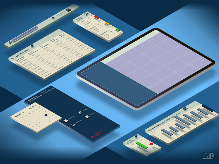
Isometric mockup of the user interface
Hello, guys 🖖
🥑 During the work on my Website Portfolio I designed an isometric mockup of the user interface for the logistics company. The project you can watch HERE.
Why did I decide to create an isometric mockup?
To show each part of the interface in more detail. The objects look like 3D models. I added 2 big stripes to separate different types of elements.
To demonstrate a hierarchy of elements. What indicators are the main on each section of the dashboard.
It took more than 3 hours to create this design asset. At one moment I needed to rework some elements and change the style of the whole mockup. All these difficulties made me a little stronger as a designer 💪
Don't miss my next shots!
⬇️Stay tuned and subscribe⬇️