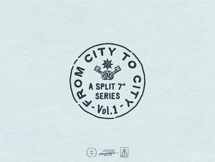
From City To City
🎵 Emblem Logo Solution for the “From City to City” Vinyl Collection by Thirty Something Records.
It's a fully hand-drawn circular design that resembles a vintage postage stamp.
I chose sans serif typography as it feels contemporary and conveys approachability through its casual vibe.
🗝️ For the icons, I decided on two keys that are connected - meaning the artists each have their own "key to the city", and they're coming together on the record.
Above them is a Wind/Compass Rose, a graphic used in old maps, that communicates that the series will include more than one location. 🧭
More by Coric Design View profile
Services by Coric Design
Like
