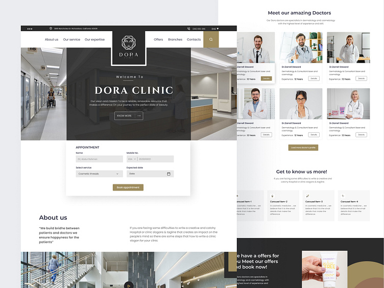
Dora Clinic Landing Page Design
Hi Folks!
I'm just free and passing a free moment then I thought let's redesign Dora Clinic,
Focus Point I tried to focus more on usability, more customer-centric, and focus branding, And make it easy for users to understand easy their services
Please let me know your feedback in the comment section!
Booking appointment, Calender view and the process will be look like this
When the Booking is completed user sees the schedule of the appointment, and this will remain same place for user best understand the confirmation the date and doctor name
This is just a getting quick information about individual doctor, when you visit the old site you will understand the boring and hard process of the knowing the information about doctor and the booking appointment is also too hard for user, head user will be feel comfortable and easy to booking a schedule and know about the doctor, and easy process to get back his previous screen.
Basic information the before and after, you can see the difference between the old design and the new design
Shoot your business inquiry to
Portfolio:
Mail me for more details


