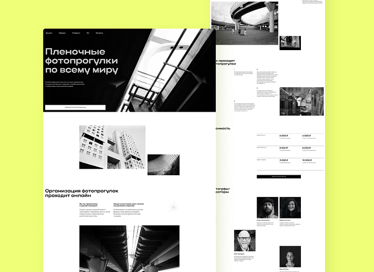
Landing page for a film-photography project
Mixture of creative chaos and strict rules
The aim of the website is to tell about the film-photo project. Professional film photographers organized photo-walks to unite enthusiasts from all over the world and create a community for them. The website must show the atmosphere of creativity and endless potential of film photos.
I designed a black and white website to match the photos and not distract attention from them. The elements seem to be chaotically thrown around the page. But in fact they strictly follow the grid. Just like in photography, the website is a mixture of creativity and rules.
Rhythm and repetitive patterns is what helps to achieve visual integrity. Slight animation and a large amount of white space allow a user to focus on the main thing: the photos and the text.
Thank you for watching!
I'm Sophia, a web-designer. I create neat and easy-to use websites for business and experts. See my website to learn more about how I work:
I share more of my design on instagram: instagram.com/sophia.webdesign
Text me on telegram if you have any questions or want to discuss a project: t.me/sophia7723

