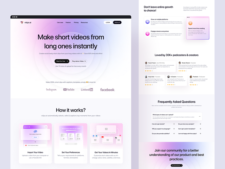
[Redesign] vidyo.ai Landing Page
Hello Everyone👋
As a content creator, it has always been a dream to be able to edit video content quickly with great results, especially for beginners or those who are new to the world of video editing. Learning in-depth video editing skills can take a long time and require significant expenses. Alternatively, hiring a freelance video editor can also be expensive for content creators. Therefore, having a platform that allows content creators to edit videos quickly and independently without the need for a freelancer would be extremely helpful in reducing the time required to learn video editing or reducing the cost of hiring a freelancer.
Fortunately, there is a video editing platform that uses super advanced AI technology, namely vidyo.ai , which allows content creators to use it easily and quickly without having to spend a long time understanding video editing. The platform also provides various incredible templates.
My contribution to this project was to redesign the UI to be cleaner and organized, while still prioritizing the UX aspect to ensure it is easy to use for the user/content creator.
Oh yeah guys, btw this is just an Exploration for me in redesigning the vidyo.ai website.
What do you think of the redesign I created? Please let me know in the comments section, and don't hesitate to like this post if you found it helpful🙏
Thank you all!
Mockup Version💻
Full Screen Version
Thank you for scrolling!
We are available for new projects
📪 Email: hello@vektora.studio | 🌐 Website : Vektora.studio
🎯 Skype: Keep in touch 😀 | 👋 Instagram: Vektora.studio
🛍️ Ui8: Vektora Shop | 💰Gumroad: Vektora Gumroad


