Celebrare: UI/UX case study
Bespoke wedding cards aren't much thought about, but the people in Celebrare begs to differ, offering most exotic wedding card options regardless of religion, social background and ethnicity. This is my attempt in redesigning the existing website to look more "royalty".
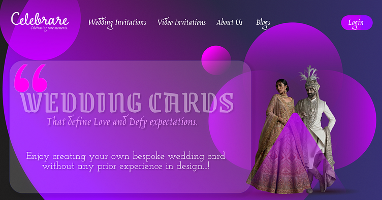
Landing Page
The layout is drenched in shades of Purple, Blue and tint of Blue accents to make it look striking. ("I donno if its just me , but this layout reminds me of Cadbury Diary Milk ") .Typography used majorly is "Jim Nightshade" and 2 more to suit the design purpose. A block of Glassmorphic Card gives it a modern luxury touch.
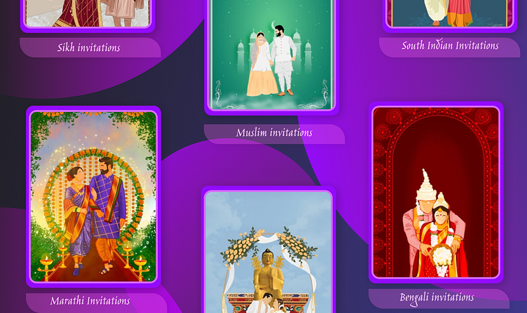
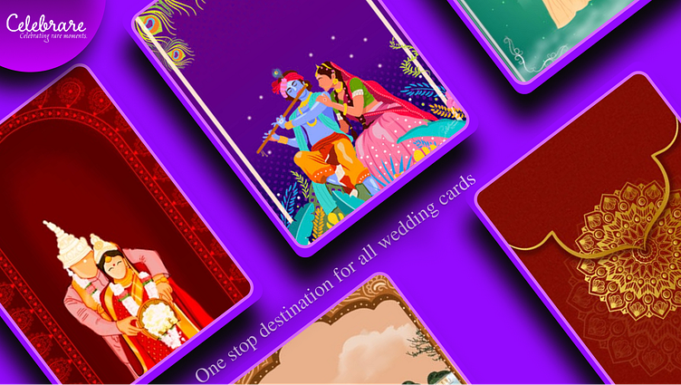
Catalogue Page
With the Purple background, baby pink stroke placed upon the spatial background gives it a striking look . With glassmorphic name tag with "Jiimy" typography suits the Indian touch.
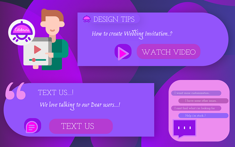
Tutorial page
This page with flat illustrations and minimal texting added to the existing accent colors make the User Experience much more hassle-free and engaging.
