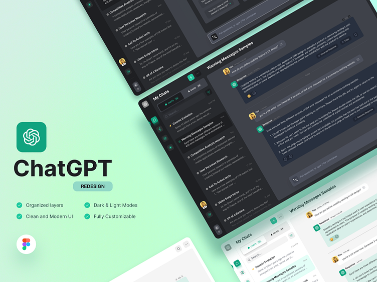
ChatGPT Redesign🔥
Dark and Light versions
For the people who love UI skins. I always prefer dark versions for UI skins(If there's any). What do you guys prefer?
UI Kit🌈
A minimal UI kit with Dark & Light icons, Colors, Typography, and organized layer structure.
UI Breakdown⚡
I used an 8-point grid system in the design to create consistency and alignment, making the interface more user-friendly and visually appealing.
Thanks for scrolling all the way down here🎈
I hope you enjoy it!
Don't forget to press "L" if you like it! ❤️
Cheers! 🍺
More by Vishakh View profile
Like


