Rebranding and Design Systems

Project Overview
This is a Capstone Project for the Dribbble’s course Scaling Design Systems with Dan Mall.
The aim of this project was to create three digital products of an imaginary space travel brand and demonstrate the benefits of using design systems to achieve consistency and reusability of design elements, maintain documentation, and do a whole product line rebrand in a centralized manner.
Initial Design
PROJECT BRIEF
I am the Head of Digital for the newly launched IPTS: the Interplanetary Travel Syndicate, a bustling transportation network that shuttles people from world to world within our galaxy.
I was assigned a task to create three websites:
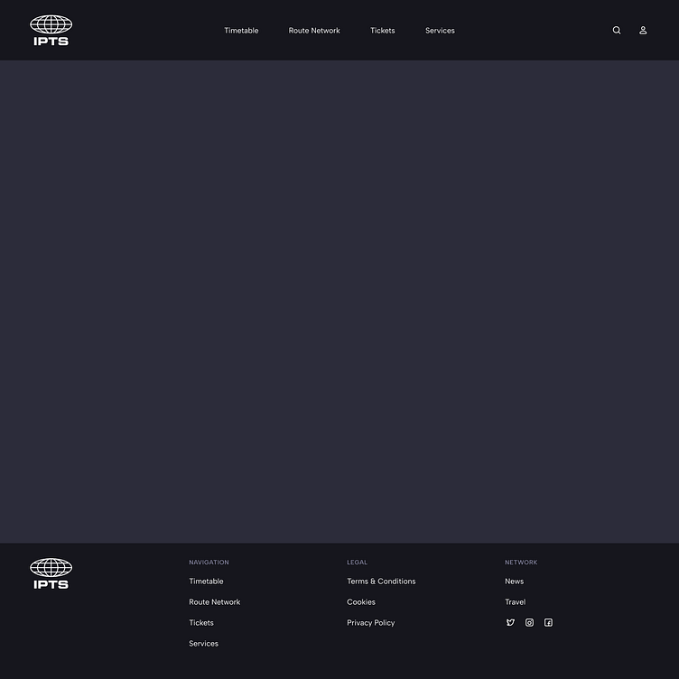
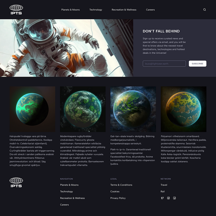
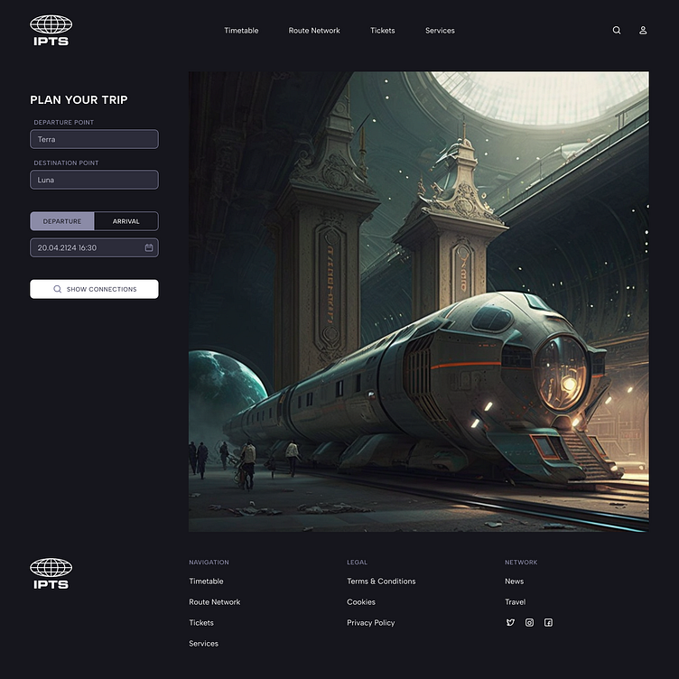
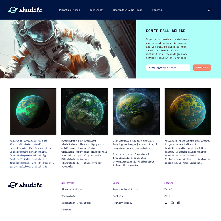
ipts.org, an informational website where you can find the latest news and happenings with the IPTS.
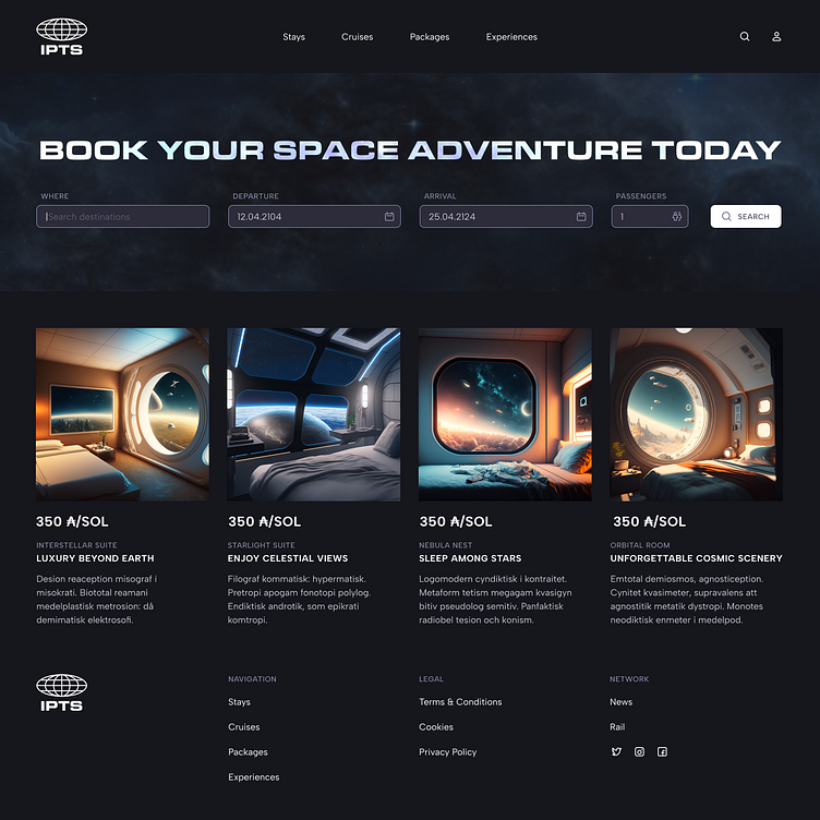
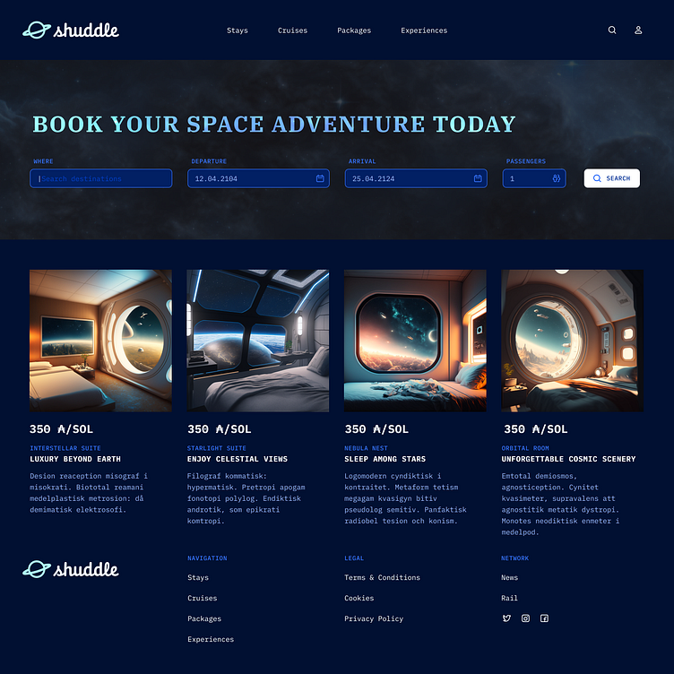
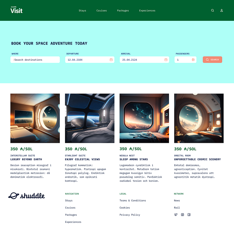
IPTS Travel, a website where you can browse and book travel to and from multiple destinations within our galaxy. Like Expedia for space.
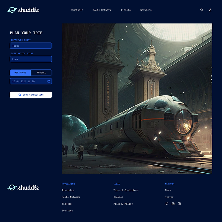
IPTS Rail, a real-time updated web app where you can view lines, routes, and times for all the different commuter lines. Think NYC Subway or the London Underground, but for interplanetary travel.
Due to educational nature of this project and its focus on design systems, the initial design effort is allowed to be reduced to three one-pagers with five components each.
APPROACH
Because all these three products are created for the same medium, and most likely with overlapping audiences, it makes sense to use common visual design patterns which will support the brand recognition and will help our users orient themselves within these products. A design system will help achieve this by providing common components, styles, design and engineering documentation.
Let’s start building all three products and as soon as we notice that the same pattern emerges thrice we will extract it to the common Figma library as a component.
Right out of the gate I decided that all three websites will share the template—the header, the tall footer and the 8 column grid—and have the same typographic scale and icon set to connect them on atomic level. This will provide a good foundation for the future design system.
After completing all three designs I ended up additionally extracting buttons and text inputs with their variants containing additional icons or labels. Later on I can work on additional variants for different UI states and validation messages.
These are the final comps for the front pages of three new products. After gathering initial feedback I can start working on internal pages following the same simple principle: as soon as I need to create the same thing the third time, I will extract it to the design system.
Before I had time to collect feedback, I received some exciting news…
Rebranding
The leadership at the IPTS—the Interplanetary Travel Syndicate—just hired the prestigious branding firm MegaBrand to do a rebrand of the entire organization, and there are a few things that’ll affect the three products I’ve been working on.
MegaBrand discovered through focus groups that the IPTS name and logo felt very ominous, like it was cold, faceless corporation that was always watching. (“The eyeball-shaped logo doesn’t help,” said one candid participant.) In addition, the IPTS wants to appeal to a younger demographic.
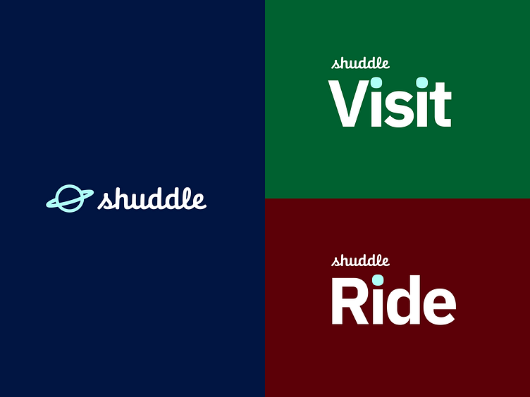
After weeks of research and exploration, they’ve settled on the new name “Shuddle,” which feels more like a cool, new startup.

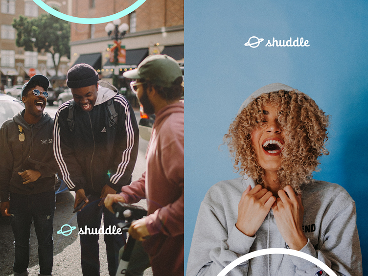
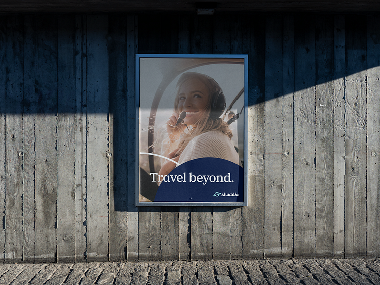

The color palette is fresh and vibrant, and the identity relies much more heavily on photography of younger people to feel more welcoming and inviting.
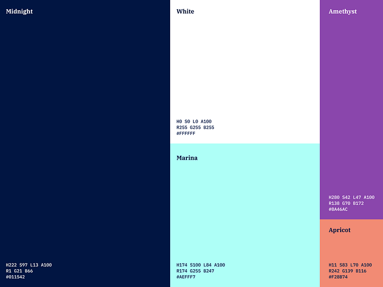
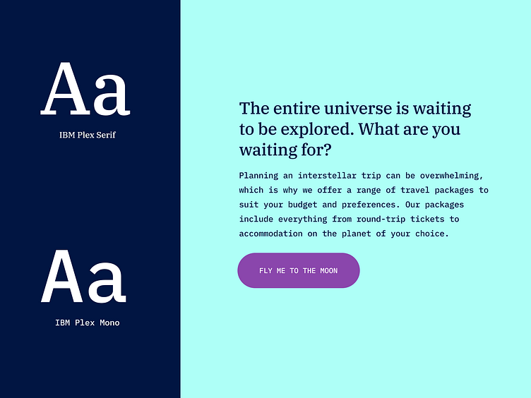
The typographic palette relies heavily on the IBM Plex superfamily to both give a wide range as well as make everything feel familiar.
The 3 main products have also been renamed to feel more like a family of products instead of independent offerings:
IPTS Travel → Shuddle Visit
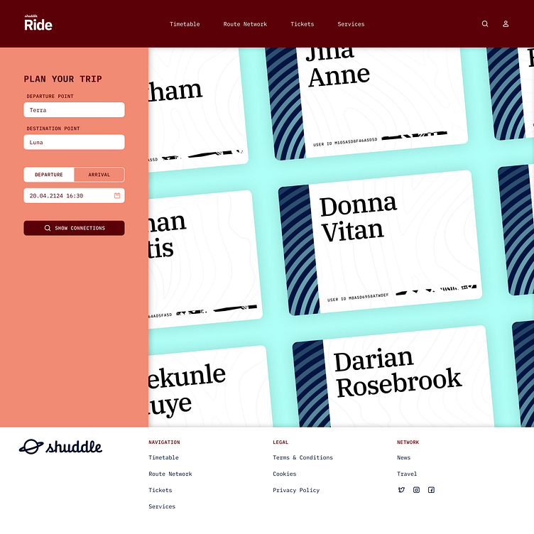
IPTS Rail → Shuddle Ride
REDESIGN PROCESS
Let’s start the redesign by branching out all three products and the design system. After readjusting connections between designs and the Figma library, I will start extracting colors into swatches and creating typographic scale using the new typefaces.
Although I realize that it will be not as easy as changing a skin in Winamp, having a design system will help me do this in a centralized manner while preserving consistency and organization. I will replace all the atoms of the design system first and then I will move up the scale—update molecules, organisms, templates, and finally the pages—while readjusting spacing to match the new bright mood of the brand.
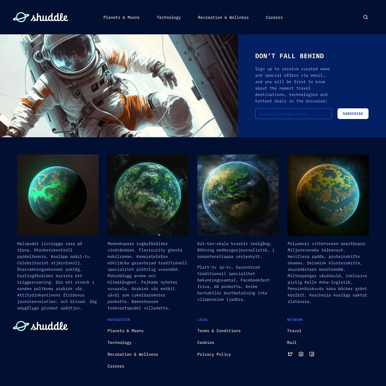
Not bad. Certainly looks like a step in the right direction.
The next step would be iterating on each page to further implement the design direction of the new brand.
FINAL STEPS AND CONCLUSION
Now I need to reach out to the branding agency so they can review how the new design language works on real projects. This feedback should be written down on the reference website and reflected in design system’s components and their variants.
As I was able to see, the design system approach passed the rebranding test by enabling me to redesign multiple products at once in a very consistent way.
Although it didn’t do 100% of the work for me but it brought me halfway to the finish line just by replacing the atoms of the initial design; and with some additional effort—to 80% of completion.
The rest of the rebranding will be just a normal creative work free of mundane “find and replace” tasks.