Online store for house plants
Good structure + simple and neat design
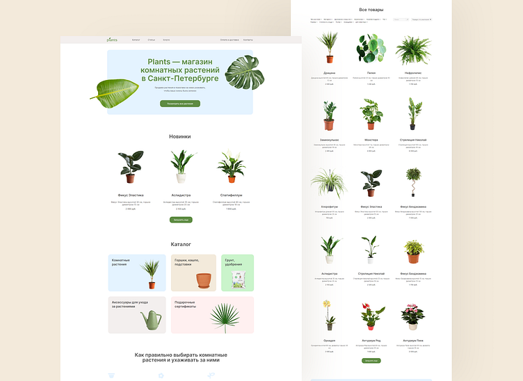
Here is a multi-page website for a house plants store. I prioritized good structure and easy navigation to make users feel comfortable on the website. The main part is the catalog with sections and filters.
I didn’t want to distract users from browsing the website with many details or extra animation. That is why the design is simple and neat, with bright, but soft colors. The visuals resembles with the main values of the company: to keep their plants clean and healthy, be positive, open and ready to help and support.
Thank you for watching!
I'm Sophia, a web-designer. I create neat and easy-to use websites for business and experts. See my website to learn more about how I work:
I share more of my design on instagram: instagram.com/sophia.webdesign
Text me on telegram if you have any questions or want to discuss a project: t.me/sophia7723

