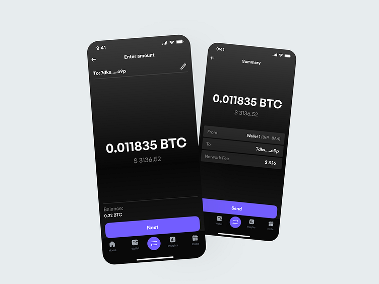
Investment App - Part 2
This is part 2 of the concept investment app.
Here, you can see the transfer screen, followed by the review details screen.
The goal of this design is to be user-centered with an easy-to-use interface that conveys a clear message to users.
Feel free to use this as an inspiration for future projects.
DM me or check the link in bio if you want to work together.
Have a wonderful day! 👋
Catalin
More by Catalin Badescu View profile
Like
