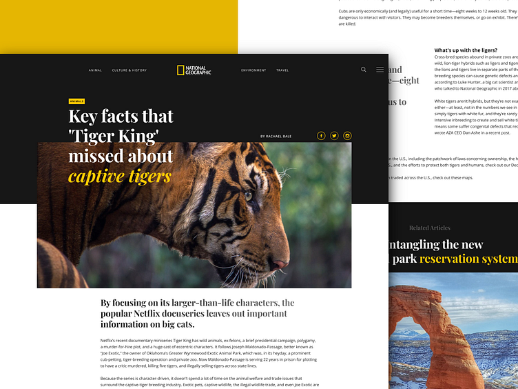
UI Article page: Clean and minimalistic Interface for NatGeo
Wanted to take a shot at the NatGeo article page since wanted to flex my Design muscle.
The main focus of the redesign was to make the content the hero of the page as well as to align it in such a manner that it will be easy to read.
Generally, magazine article pages are very cluttered with both the content and the advertisement fighting for attention. So removing the advertisement part apart I just wanted to focus on the content.
#minimalistic#natgeo#minimal#article#ui#uidesign#uiux#content#typography#tiger#tigerreserve#design#website#web
Let me know in the comments how the design has shaped up.
Inspired by the clean and straightforward design trends in web design I set out to design within the same set of principles as the former. Achieving a clean look as well as making the content interesting to the user was the foremost objective of the redesign.
To achieve this goal I have used google fonts with a combination of Serif and Sans serif. The design also depends a lot on the grid to give it a better Structure.

