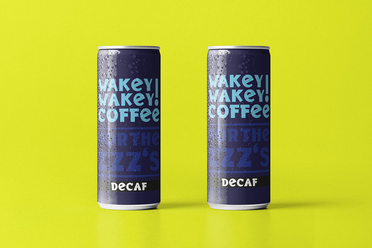
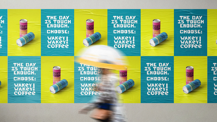
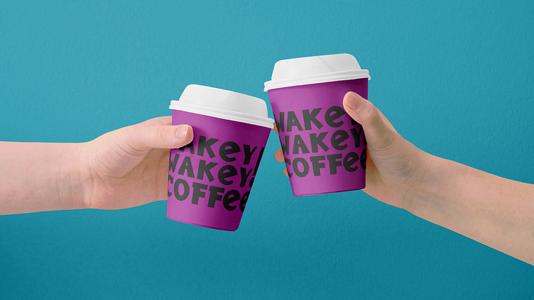
Wakey Wakey Coffee
Objective:
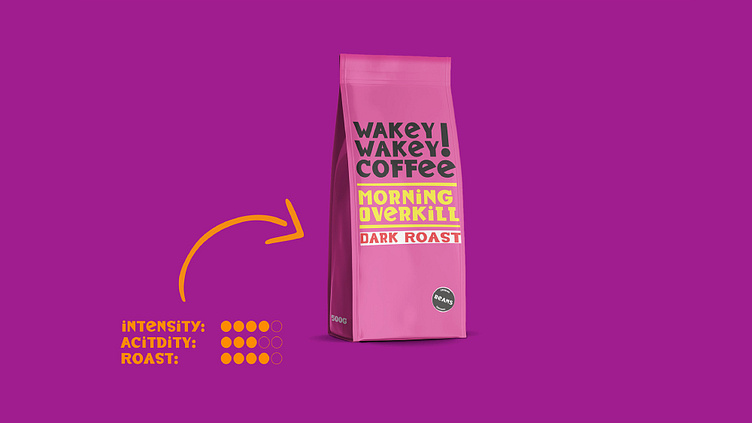
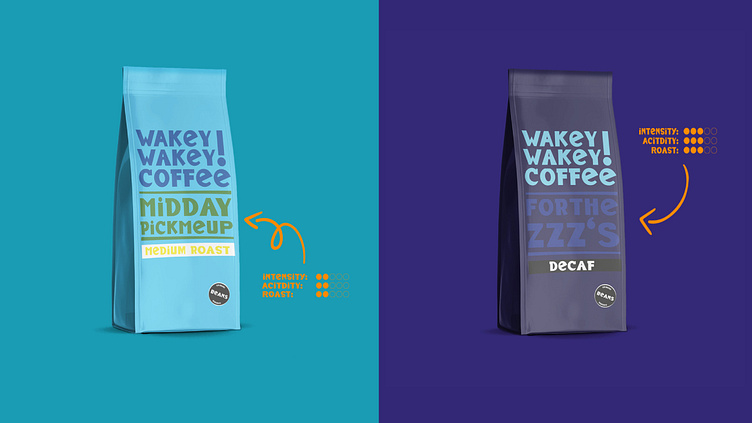
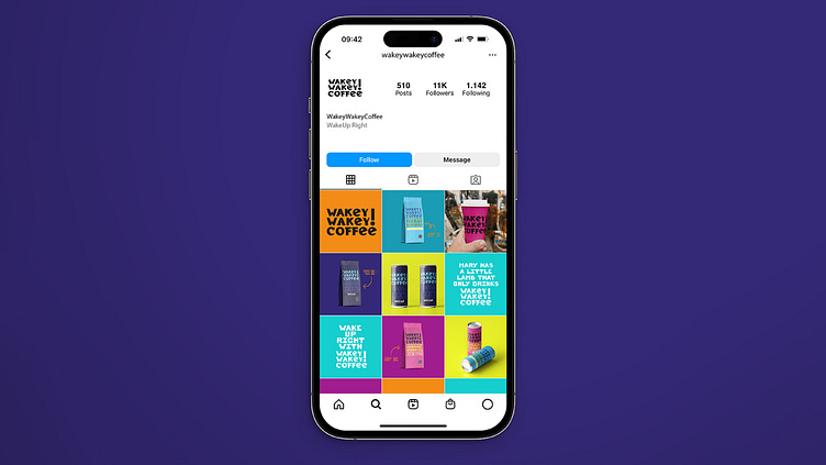
Wakey Wakey Coffee aims to create a bold, playful, and memorable brand identity that stands out in a crowded market. Designed to appeal to coffee lovers who appreciate humor and quirkiness, the packaging and branding convey a sense of energy, fun, and approachability. The goal is to create an eye-catching product that not only attracts attention but also communicates the unique flavor profiles of each coffee blend clearly and engagingly.
Design:
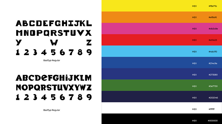
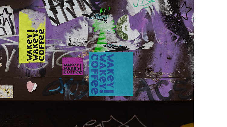
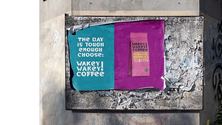
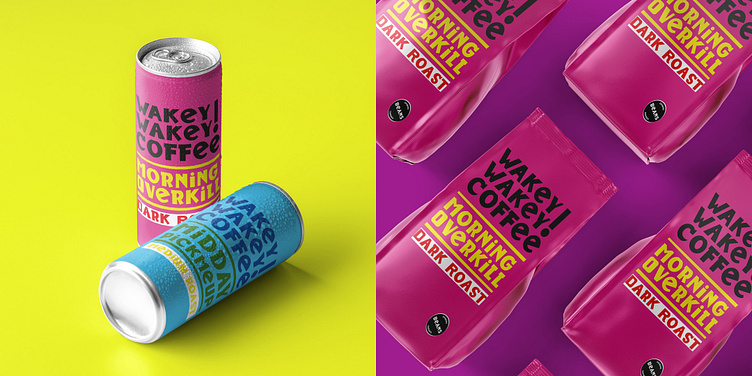
Wakey Wakey Coffee's design revolves around a vibrant and humorous approach, using bold typography, contrasting colors, and playful names to differentiate each coffee type. The branding is centered on being approachable and fun, with a strong focus on making each product easily identifiable and memorable.