GetSig SaaS Web Application Design
GetSig, an Australian startup, focuses on assisting businesses to sign documents by electronic means with innovative and patent- pending e-signature solutions at their own convenience.
The Challenge
As the leader of the team tasked with updating the GetSig application, we recognized that the outdated design and subdued color palette were hindering the user experience. Through analysis, we identified that the main obstacles for users were related to navigation within the application.
The Solution
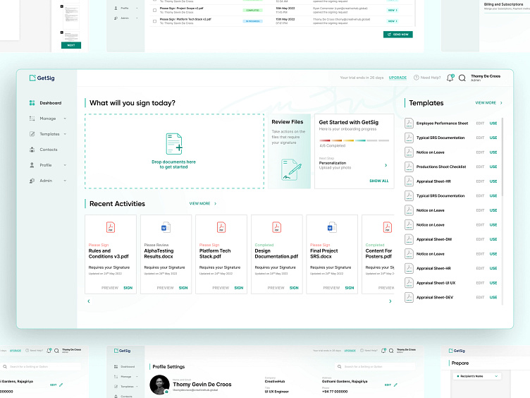
The main step that was taken to overcome the issues in the old version was to incorporate an easy to access flow in the navigation. During the process of placing the sign, the users would be able to see where they stand in the application which reassures them about their position.
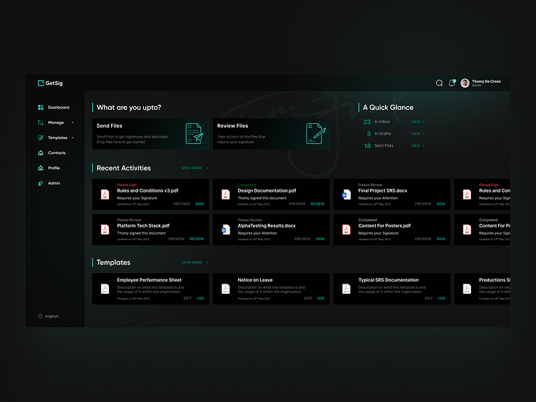
This solution was used on both desktop and mobile screens, and the color scheme was tailored to suit the site.
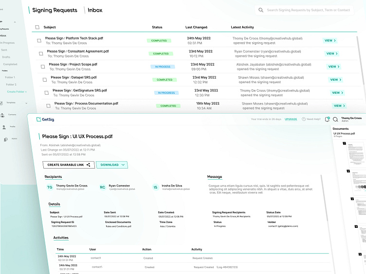
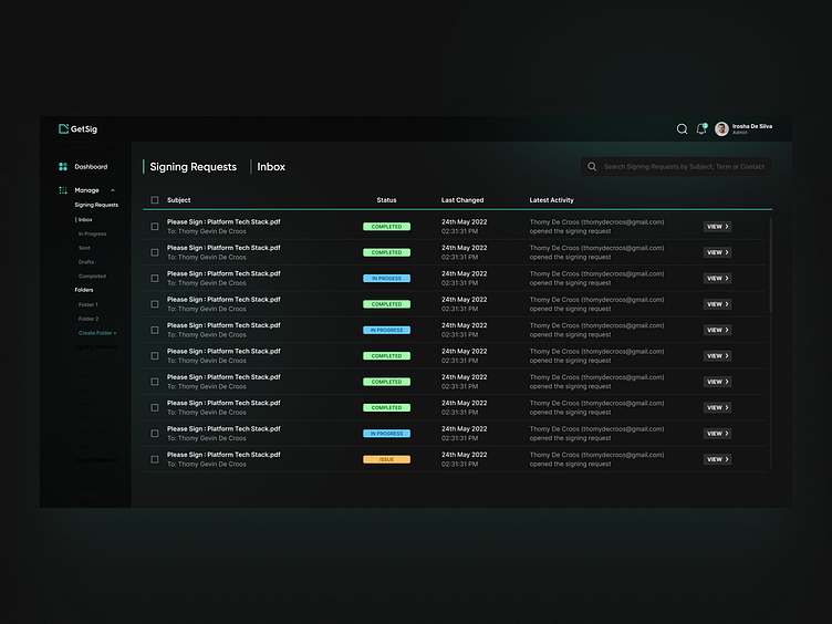
The UI incorporated a trouble free way of viewing the signing requests, in the form of tables, so that the users could easily access and be notified of any urgent requests.
Much attention was also given to the mobile screens in order incorporate the same ease of use for the users as in the desktop designs
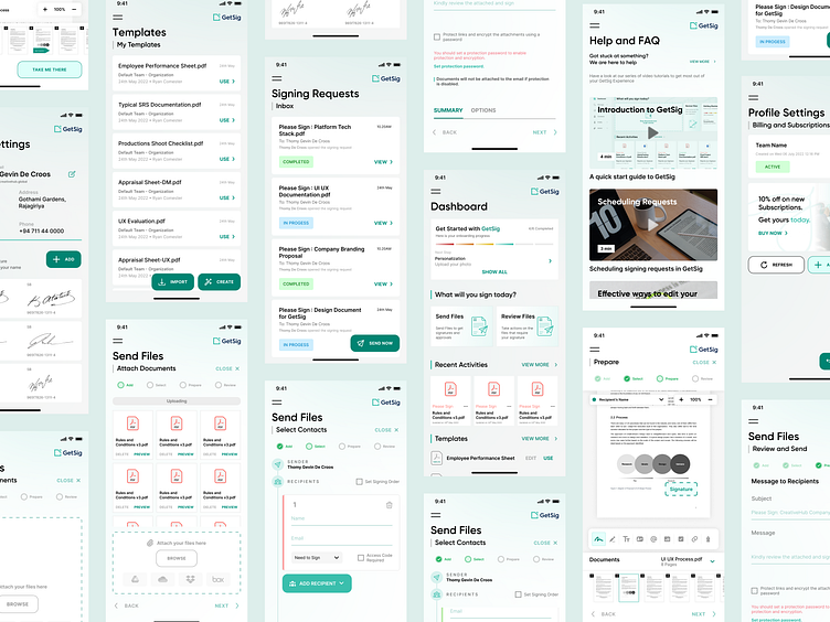
A ‘Help & FAQ’ section was included in the system in order to aid users in gaining a better understanding of the system and to improve its ease of use.
I thank Creativehub Global for giving me the opportunity to lead this project. To see more of their projects and work, have a look at their Dribbble profile.
Show some love by pressing “L” and save it for later inspirations.
What do you think of this design? Let me know in the comments!
