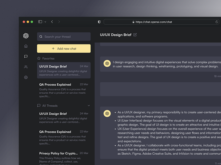
AI Chat : ChatGPT Redesign
Hi everyone 👋
Today, I want to share my new exploration for ChatGPT redesign. This time I focused more on the chat thread page and there were a few changes on the main page. I also made two version of it, dark and light mode.
Home Page
As soon as we entered the ChatGPT for the first time, we'll see some question suggestions, their capabilities and limitation. In this page, I made the chat box more recogniziable for the users. So, they'll easily try to ask anything.
Components
As I learn more about auto layout and how we build a design system or ui kit, I want to share how I build the components for both dark and light mode. As we can see, I use the same color for left small sidebar and buttons. But, I use different color background and primary color to the text.
I also made pop-up modal for user who wants to updgrade their account and make it easier for them to get the information such as the price and benefits in bold.
Thank you for watching until end! Kindly inform me if you have any feedback or recommendations to improve the experience. I am constantly seeking ways to enhance the user experience. Also you can press "L" if you like this post. See you on another project! 👋


