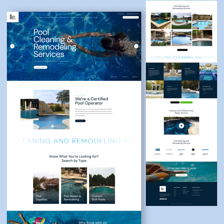
Pool Landing Page
Hello Dribbblers,
Today I'm happy to present my new shot with you – it's a Modern & Clean Landing Page for your Website. I tried to make it look clean with more empty space and tried to use some bright colors for the design to make it look interesting.
Please share your feedback about the color choice and placement of the elements. If you like what you see, don't forget the press the ❤️ icon and follow me Dribbble.
More by Rizwan Haider View profile
Like
