The Academy - Case Study
A Personalized Learning Experience
Hello 👋
The Academy is a learning platform where users can find information from help articles, courses, videos, and product practices, providing them with the means to effectively use a software product. This platform has been around for a couple years and was no longer serving users as well as it once had. Content was difficult to find, there wasn't a clear place for users to start learning, and overall navigation needed help.
My goal for this project was to offer each user a VIP learning experience based on their range of product knowledge, while considering varying use cases and skill levels. I wanted to organize the learning content based on user roles, that would also define a good starting place for new users.
Follow along to learn more about how the Academy got its facelift!
User Research 🔬
I began this project by tackling my initial challenge of creating a learner persona. Because the average user often wears many hats and represents a variety of product use cases, this was the most difficult task. Thankfully, the Academy had collected a lot of user data over the years, so I was able to pool together a list of qualified users to interview.
I conducted 20+ user interviews and found several pain points and content gaps that when solved, would create a better learning experience for those users. Those pain points include:
General navigation is bad, making it hard to find content
Users don't know where to start, there are no clear pathways
Users don't know which content to use to train their employees
User Flow 🏗️
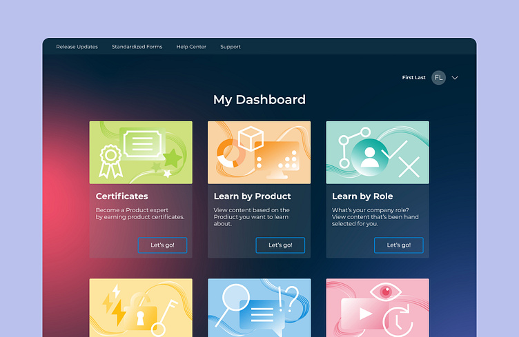
I created my user flow by focusing on my users' pain points and the existing Academy. Many users had a hard time finding what they were looking for or didn't know what they were looking for at all, so I wanted users to see what they needed right when they landed on the homepage.
I utilized my user persona quotes to build six unique pathways, that way each user could quickly recognize where they needed to start in the Academy. I organized the content accordingly, to reduce the amount of clicks it would take a user to access the information they were looking for.
Ideation & Wireframes 💡
I experimented with many iterations of sketches and wireframes. I primarily focused on the homepage and main learning sections because that's where each user would begin their journey. I wanted it to be simple, modern, and fun, a place where our users could enjoy learning in a functional way.
I then moved on to each main section's content pages, I wanted there to be as few required clicks as possible for a user to find the learning materials they're looking for. This would solve the confusing navigation and reduce time spent searching for content.
Visual Design 🎨
The software company already had brand guidelines in place, but I wanted to create the Academy's own vibe, while setting it apart from other learning platforms in appearance.
I was drawn to the dark background with pops of bright colors on top, making the space feel fun and inviting. I also created a modern look and feel by adding rounded elements, large font sizes, and negative space.
I then scaled the design across all the wireframes to produce a final product.
User Testing 💻
Before the redesign, users were having trouble navigating the platform to find content and didn't know where to start. Since the described changes were implemented, there has been nothing but positive feedback coming from our users. Not only do they love the look of the updated platform, but they also are finding content easier. Here are some win metrics:
Getting started content has increased in views by 71%
Certificate earnings have increased by 6%
Overall satisfaction rating has increased from 4.6 to 4.7/5
Time spent onboarding customers reduced by 15%
Final Thoughts 🧠
The Academy has been growing and changing for the past few years, including a change of audience, change in content needs, the growth of the company, and more. This iteration of the Academy will continue to serve our customers and provide relief for our customer support team.
Thanks for following along! ✨


