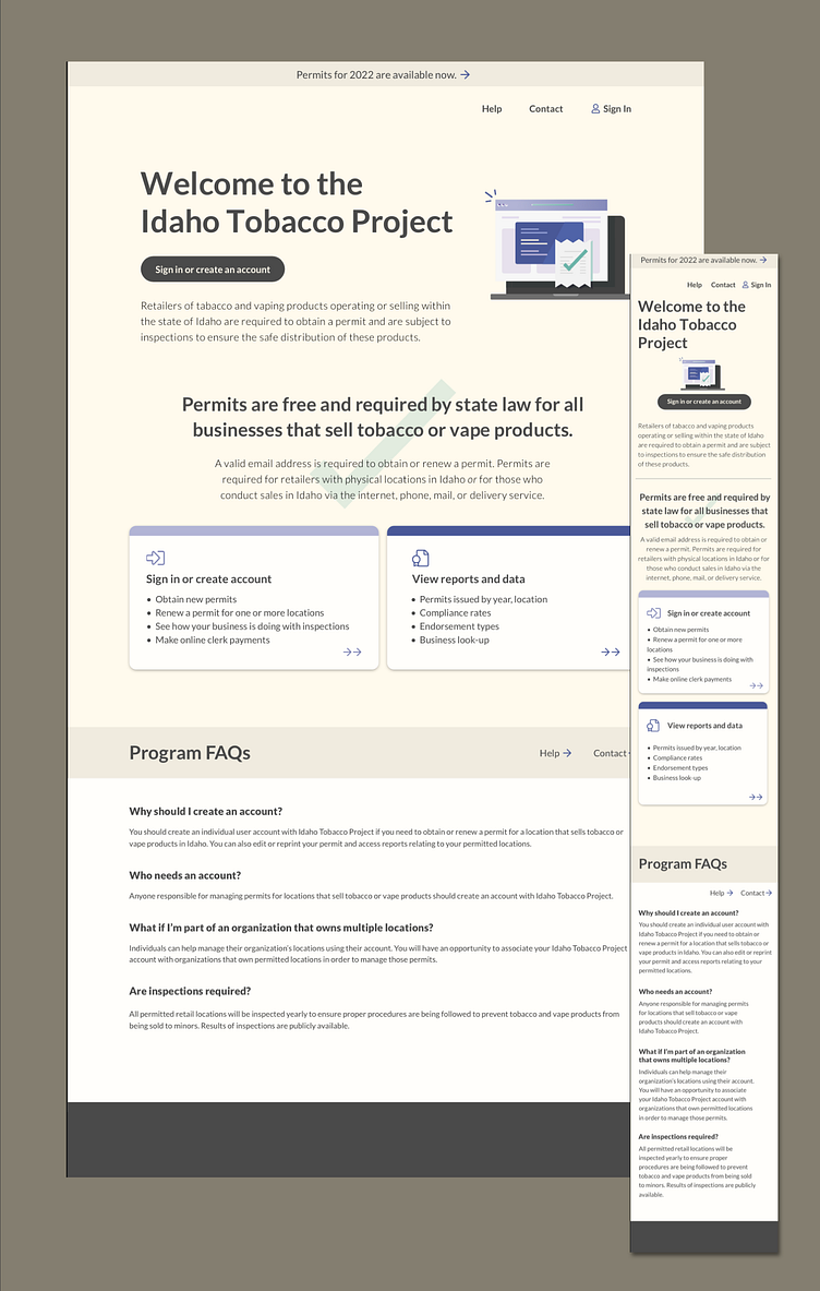
Graphic exploration within a state-level style guide
This represents one graphic direction explored for a refreshed / overhauled website for an important state program. Working within a departmental-level style guide, the homepage for this simple program website is fresh, modern, muted, and inviting. Key actions are clearly distinguished, the pops of color are used sparingly, and language is authoritative and serious while still being accessible, simple, and easy to understand.
Speculative graphic exploration done as part of GWW project.
More by Sarah Crossman View profile
Like
