CrossBorder Payments - Landing Page Concept
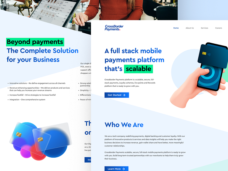
Excited to showcase my latest website UI design for CrossBorder Payments, a cutting-edge payments platform. The design prioritizes a clear information architecture, ensuring ease of navigation and enabling users to quickly find the information they need. The messaging is concise, yet comprehensive, helping users understand the platform's value proposition and functionality.
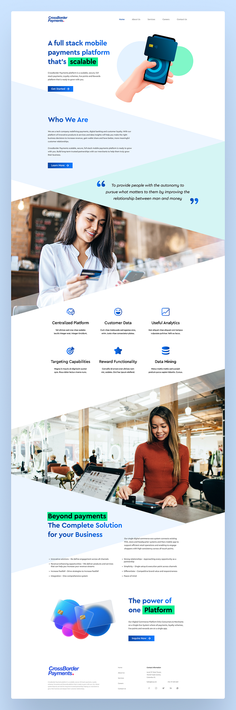
The blue color selection is both professional and intentional, communicating trust, reliability, and security - all essential traits for a payments platform. The psychology behind the color selection reinforces the platform's mission and vision, enhancing the user experience.
Show some love by pressing “L” and save it for later inspirations.
Let me know what you think of the combination of design, purpose, and psychology in the comments!
