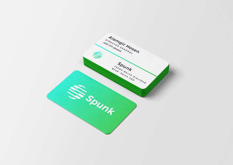
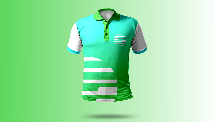
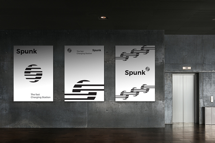
Spunk Brand Identity Design

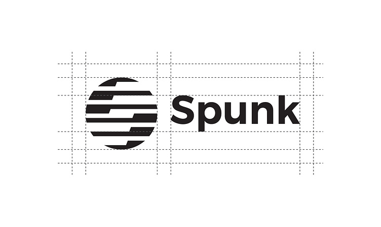
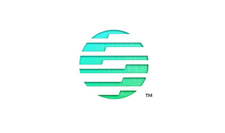
Spunk is a short and impactful name that starts with the letter S, which perfectly aligns with logo design. The circular shape and S negative space in letter mark logo evoke the idea of electrical energy flowing through a circuit, and spunk reinforces this imagery.
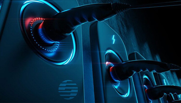
The name spunk also conveys the idea of reaching out and connecting, which is perfect for an electric charging company that aims to provide power and connectivity for various devices and vehicles. With its strong sound and memorable visual identity, Spunk is a great choice for futuristic charging brand.
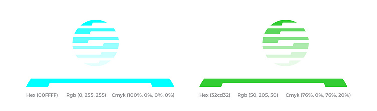
Color Palette: Since the logo is a combination of a circle and S shape, we consider using circular and flowing colors such as blue, and green to represent energy and innovation.
Electric blue (#00FFFF) Lime green (#32CD32)