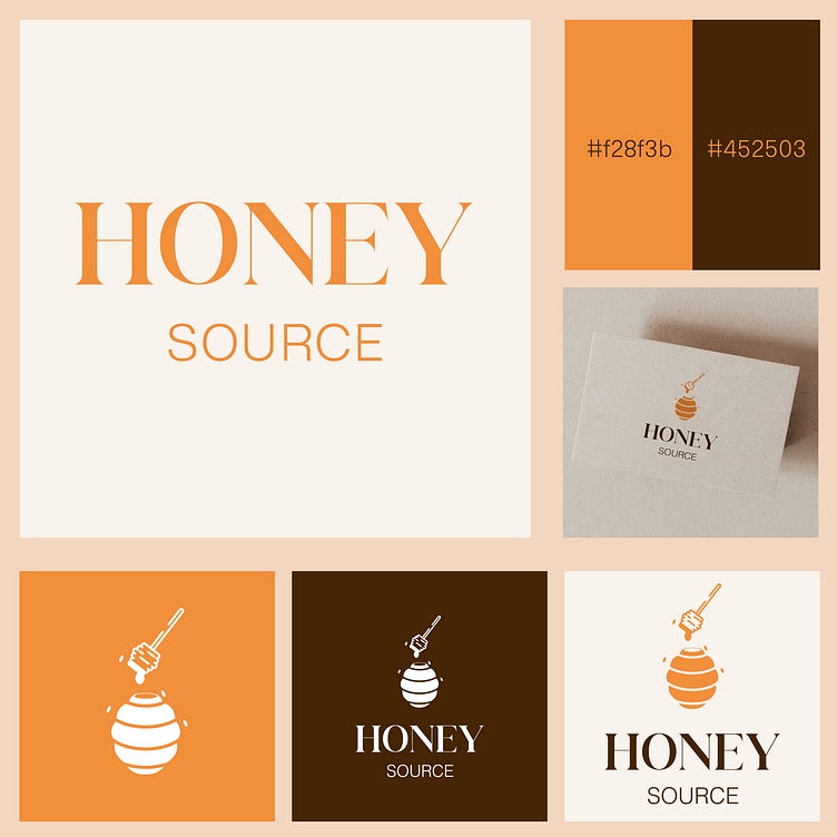
Honey source - logo design
🍯🐝 Check out our new honey logo! 🐝🍯Our logo perfectly represents the natural and authentic Honey Source brand 🌿 The 🐝 hive symbolizes the source of the honey, while the 🥄 honey spoon represents the product itself 🍯 Together, they form a strong visual identity for our brand that communicates the purity and quality of our client's brand 🌟 The warm and inviting colors and modern font give a fresh touch to classic symbols ✨#honeylogo #naturalhoney #beekeeping #sweetnessofnature 🌸#brandidentity#brandingdesign #graphicdesign #logodesign #visualidentity #brandstrategy #designthinking #brandingagency#brandingexpert #packagingdesign
More by Creative Hub Design View profile
Like

