NexiaLife - Smart Home Control App
This is my design of a smart home control app.
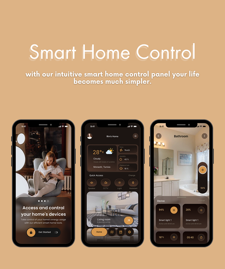
In this model, you get to access your devices in the living room, kitchen, bathroom, bedroom 1, bedroom 2 and guest room.
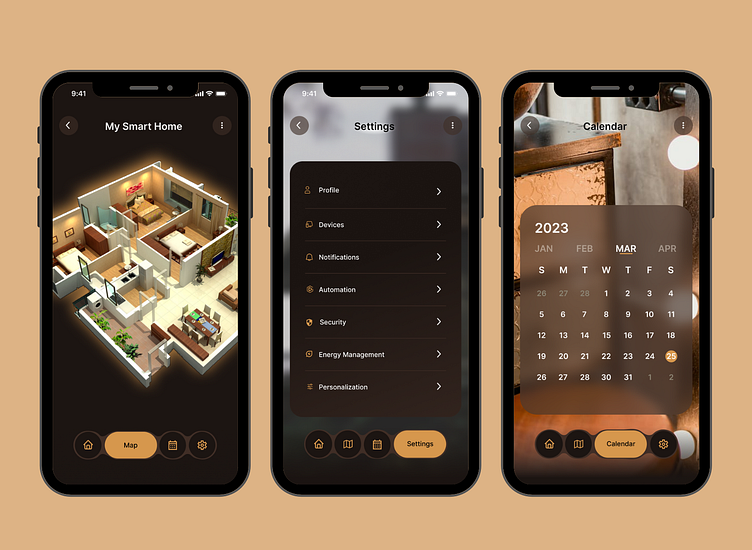
You also get to look at your 3D home model and pick which of your rooms you would like to control.
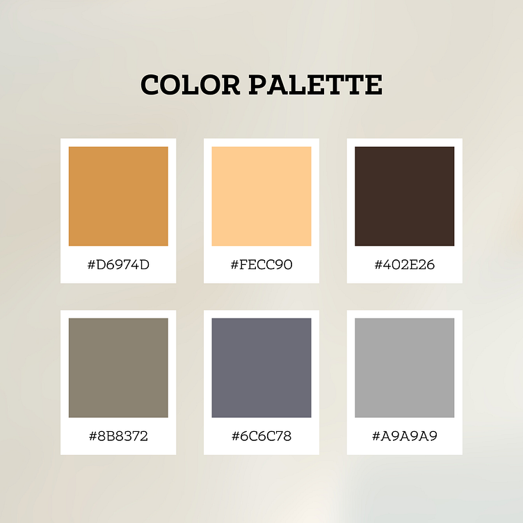
Choosing a color palette for a smart home app design requires careful consideration of several factors such as the brand identity, target audience, and the overall user experience. Here are some reasons why brown, beige, and orange shades might be a good choice for a smart home app design:
Warm and inviting: Brown, beige, and orange are warm and inviting colors that can create a comfortable and welcoming environment for the user. In a smart home app, these colors can help to create a sense of coziness and comfort.
Natural and organic: These colors are often associated with nature and the outdoors, which can be a good fit for a smart home app that aims to promote eco-friendliness and sustainability. They can also convey a sense of reliability and stability, which is important in a smart home app that manages devices and appliances.
High contrast: The combination of brown, beige, and orange can create a high-contrast color scheme that can help to draw attention to important elements in the app. This can be particularly useful for alerts and notifications that require immediate attention from the user.
Contemporary and modern: While brown, beige, and orange are traditional colors, when used in the right way, they can create a contemporary and modern look that is perfect for a smart home app. By combining these colors with sleek and modern design elements, you can create an app that feels fresh and cutting-edge.