Harrowgate - Concept 03
Harrowgate is a start-up focused on human resource management and associated technologies for high-performance teams.
More info about the project at this post :)
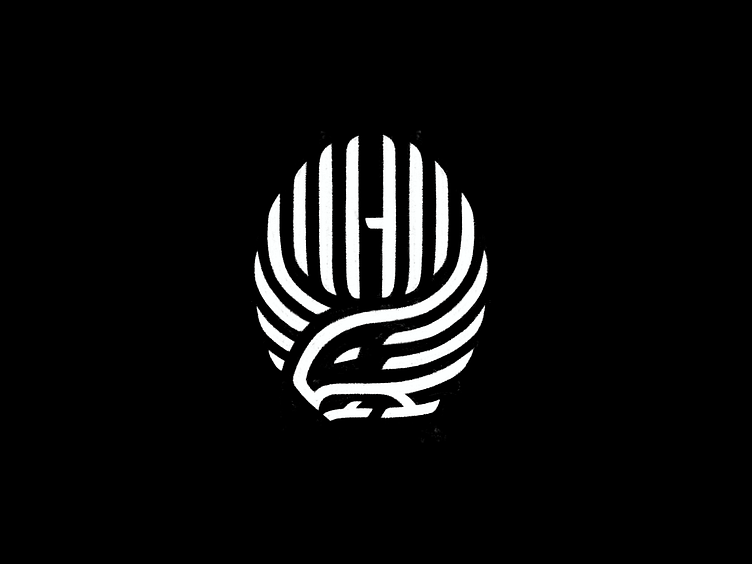
I think this version was special due it's unique combination of ideas, here I could portrait the eagle in a 'not so evil' attack position, yet a profile position that shows his very recognizable beak shape, plus it's talons and wings suggesting the gate. Still managed to put the H details on it, what is a spot on!
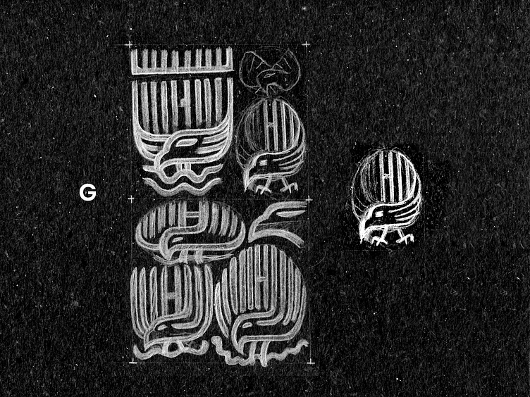
Details of the chosen concept (3/3) initial sketches explorations above. Spoiler alert: this one was the chosen for the final logo!
I still feel that there's too many lines over this symbol, this is surely something to give a special attention further. Of course the balance is also an issue, and specially the talons are given me a headache to solve visually, you'll see how I've solved this in the next post of this project in details :)
I hope you'd liked this concept refinement process!
(final version yet to show in the few days, stay tuned)
Also I'm available for new projects, so feel free for ask me!
Need a logo, illustration or other crazy stuff? Email me now :)
Follow & Connect!
Behance • Instagram • Facebook • Twitter • LinkedIn
/bitencourt or /allopoietic over any networks!