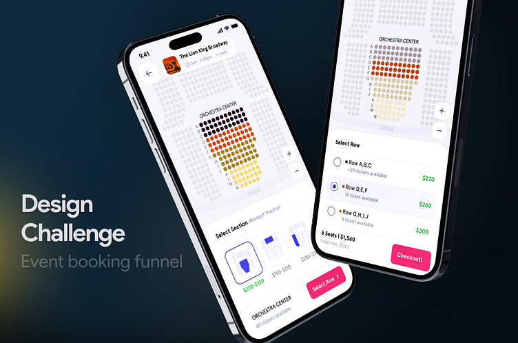
Case study: Event booking design challenge
You can find this design challenge and my solutions here:
------------------------------------------------------------------------------------------
Introduction:
After more than seven years of designing, improving, and optimizing digital products, I decided to seek new experiences and prepare myself for international challenges. As soon as I started applying to several companies, I was interviewed by a European startup. This startup provides access to hundreds of thousands of tickets (events, museums, cinemas,…) at the lowest prices. Following an interview with the CEO, I received a design challenge. You can see the design challenge that I was given along with my solution and design below.
Design Challenge:
I was asked to redesign the “Ticket position selection” step in an event’s ticket booking funnel. This product, however, allows the user to select only a section and seat row, not a specific seat.
------------------------------------------------------------------------------------------
Challenge description that was sent to me:
The challenge is to redo this 👆 page to improve its usability (you can change any element of the page).
Limitations:
Providers do not tell us the specific seat for any entry, we only receive the section and row.
Requirements:
The date and time of the function must be displayed
------------------------------------------------------------------------------------------------
Read the full process of this design challenge here:
https://bootcamp.uxdesign.cc/event-booking-design-challenge-638881904696
------------------------------------------------------------------------------------------------


