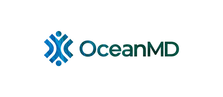
OceanMD Logo Design Project
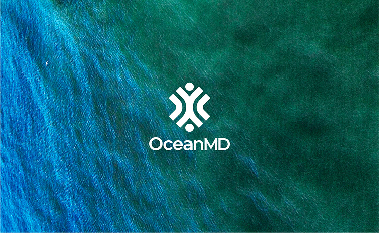
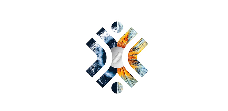
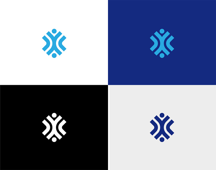
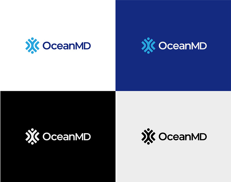
OceanMD is a nutraceutical, Health, and Wellness food supplement company. The request was to create a logo mark that reflects the idea of “Synergy between Nature and Science”.
When researching deeper, it’s realized that Science is almost Nature and Nature is almost Science; beginning from this idea, an abstract logo was created by blending similar looking waves like elements in a way that creates a “human figure” like shape in the middle. Elements approaching from opposite directions and intersecting represent the idea of “Creating Synergy between Nature and Science” and the “Happy human figure” shape resembles the feeling of “Health and Wellness”— The logo simply suggests a phase: “Creating synergy between Science and Nature in providing of better health and wellness for people”. Moreover, the logo has been developed in a style that symbolizes a “Medical cross” enhancing the idea of a Health & Wellness company. And it has maintained a “wave” style for the overall appearance of the logo keeping it more distinctive from the brand name itself.