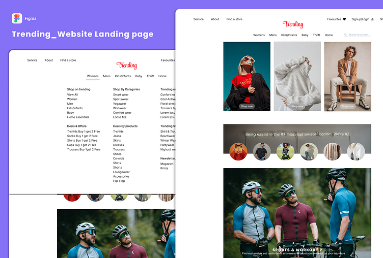
Trending_Clothing Brand Website UI Design
So far challenge pushed my limits and expand my creative horizons. With excitement and determination, I decided to take on this challenge head-on.
After replicating various designs for 18 days, the 2nd phase of the challenge had arrived, and it was time to start building from scratch based on the given prompts.
The day finally arrived, and I was greeted with the Day 19 #prompt to build a landing page for an e-commerce website. Without a second thought, I knew exactly what I wanted to create - a landing page for a clothing brand named Trending, inspired by the iconic H&M UI design.
I set to work, pouring my heart and soul into creating a landing page that would capture the brand's essence - modern, stylish, and fashion-forward. I wanted the page to be user-friendly, with clear calls to action that would encourage visitors to explore the site and make a purchase.
I focused on the aesthetics, ensuring that the layout was visually appealing, Bold typography, high-quality images, and a clean design helped to capture the brand's essence and make it stand out in a crowded online marketplace.
As I added prominent links to product categories section, featured collections, and special offers or promotions and a process to sign-in sign-up.
And now, after pouring my heart and soul into this project, I am proud to present my creation to the world. It's a landing page that is more than just a design - it's a story that captures the essence of Trending and the inspiration behind it.
If you have a moment, Don't forget to drop a 💗 and your valuable feedback
Let's Connect and share our love for design!
LinkedIn | Portfolio | prettywadhera@gmail.com
Thank you for your time and support, and I look forward to sharing my progress with you throughout the 90-day design challenge.


