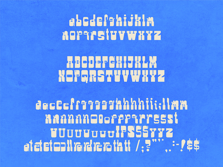
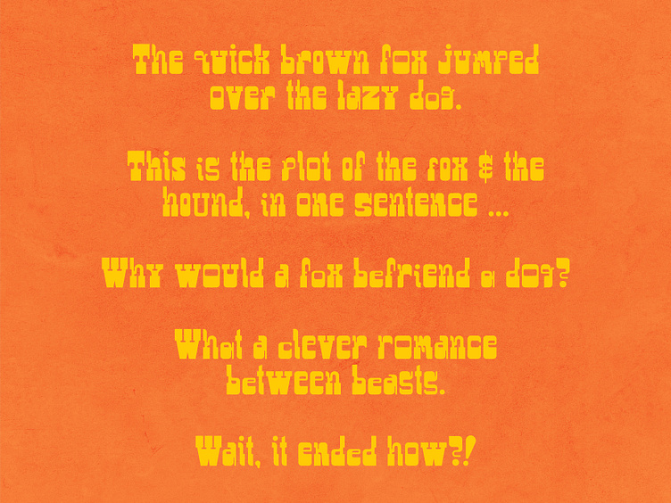
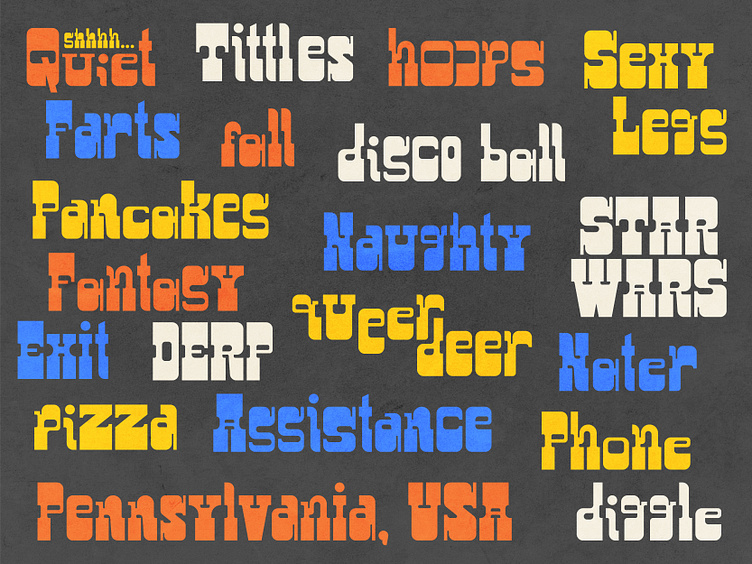
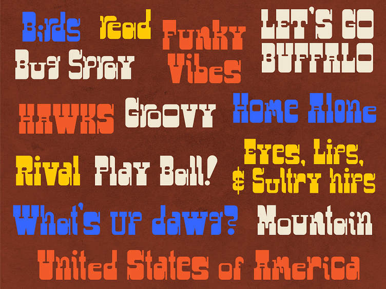
wip - Naterfont
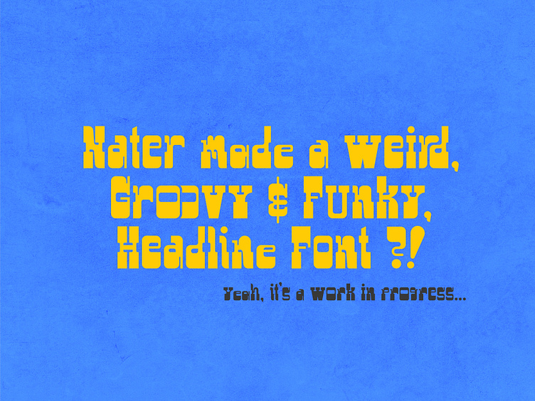
been working on my weird headline font a lot lately. made a bunch of alternates that work neatly together... I still need to finish out the symbols and the numerals; but I am happy with the way it's headed. It's weird and funky, kinda makes no sense at times... but that's what I dig about it . Some glyphs work better than others. It's been a neat learning experience. definitely need to work on the kerning and spacing around each glyph. Maybe make a few more alternates. I'll repost it again when it's done