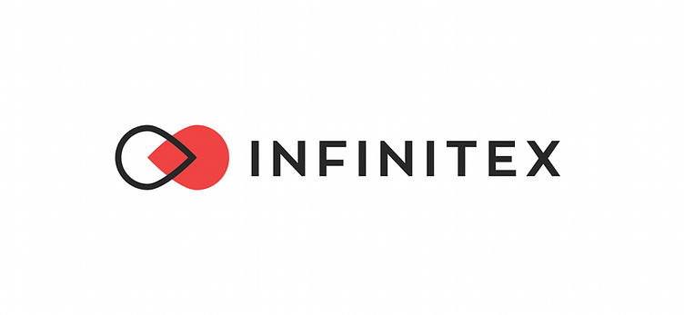
Branding design for InfiniteX
The chosen identity concept is inspired by the meeting point between humans and blockchain technology. It aims to remove the barriers and disrupt the general understanding that blockchain is an abstract idea.The symbol is also inspired by the name of the brand forming an infinity symbol in a more abstract way.The positioning and the brand messaging were focused on blockchain technology being more human and accessible and beneficial for businesses.
A few of the challenges InfiniteX were facing were:
Business people and decision-makers at that time didn’t understand blockchain technology and the benefit of integrating it with their businesses.
The current identity doesn't suggest premium services which result in clients with a limited budget.
Other logo options that we presented:
Option 01:
A concept inspired by your process of work and how you strategically analyze the business of your clients which allows you
to point to the right direction and lead the project.
This direction is a mix of technology and accessibility achieved by carefully combining certain visual elements and the right colors.
Option 02:
A responsive concept that allows being more expressive by using a wide range of visuals or being minimalistic depending on what needs to be communicated.
The logo is simple, bold, and neutral. It could be easily combined with a different visual or photography to underline the narrative.
Period:
2019-2020
Services:
Brand Strategy Development
Brand Identity Design
Stationery Design
UI/UX Web Design
Art Direction
Deliverables:
Brand Strategy & Positioning
Brand Identity
Stationery Materials Design
Website Design & Development
Credits:
Client - InfiniteX
Nikolay Petkov & Nikola Uzunov - Discovery & Brand Strategy
Tsvetan Mitev - Brand Identity Designer
Nikola Uzunov (UNICK Co.) - Website UI / UX Design
Oblik Studio - Website Development
Interested in working with us?
Get in touch
Thanks for watching!


