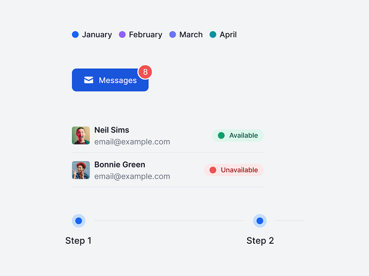
Indicators
Hello designers 👋
Today we're sharing with you another component from the Flowbite Design System: the indicator.
The indicator component can be used as a small element positioned absolutely relative to another component such as a button or card and show a number count, account status (red for offline, green for online) and other useful information.
What is Flowbite?
Flowbite is an ecosystem of open-source libraries, tools, and products built around Tailwind CSS consisting of a Figma design system, component library, website section, and page templates, and other tools.
📚 Flowbite Library - Open-source components built with Tailwind CSS
🎨 Flowbite Figma - Design system built for Figma
🧱 Flowbite Blocks - Building sections for website and applications
💎 Flowbite Pro - A larger collection of the open-source version of the latter three
👩🎨 Figma Community - Get the free version of the design system
You can learn more about Flowbite in this video by Adrian Twarog.
