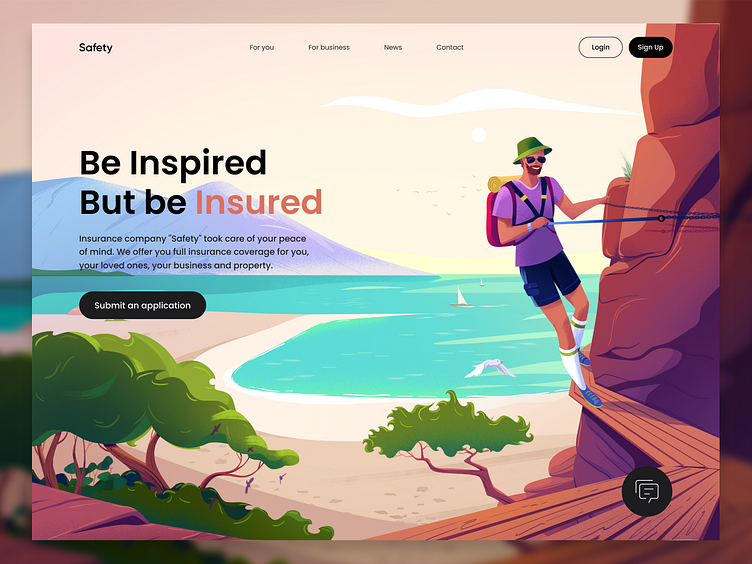
Safety - Landing page design for the insurance company
Rethinking the roots 🥹
One of the main tasks for the company is to be a little bit different on the Internet and somehow be recognizable in the huge ocean of sameness.
This was the case with this particular website project in the insurance niche.
Our illustration perfectly shows how important safety is in any situation, so it's perfect for insurance.
It has the perfect combo: a bright illustration and clear site navigation. Our version of the website for insurance is very different from the usual boring and gray sites, so it's worth separate attention!
P.S. Special thanks to our partner Bright Funk for the amazing illustration 🤩
=====================================
We design digital products that allow achieving business goals and inspire people to connect, care and act!
Email us: hello@outcrowd.io
Become a part of Outcrowd communities:
