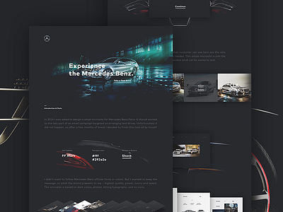
Mercedes Benz Microsite
- Behance Case Study
- Final video on Vimeo
Hello there!
I'm really glad that I can share with you the rest of my last project - the Behance case study and realpixels.
I can say I'm pretty satisfied with the whole design. It looks and feels for about 98% as I wanted. Dark, classy and with a strong typography. My goal is accomplished - don't follow Mercedes Benz official fonts or colors, but keep their main values, like luxury, power, or speed.
Hope you guys liked it and hope it was fun for you to seeing shots of this project. At least as it was for me. Let's see you soon with another project!
–
More by Jaromir Kveton View profile
Like


