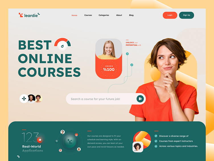
Course Web Hero
Hi there, Dribbblers!
I'm excited to share my latest project with you - the website design for an educational platform called Leardie. After developing its brand identity, logo, and social media designs a few weeks ago, I decided to take on the challenge of designing its website too. Leardie is a platform dedicated to helping users land their dream job, and I wanted the website to reflect this mission.
To ensure consistency across all branding touchpoints, I used the same color scheme and iconography as the previous design. As we all know, UI design relies heavily on consistency, and I made sure to pay careful attention to this aspect throughout the entire design process.
I value the opinions and feedback of our lovely community. If you have any thoughts or comments, please don't hesitate to share them below. And if you liked the design, please show your support with pressing the 'L' key. Your insights and support are always appreciated. Thank you kindly!
Hope you like it too Please press the (L) key.❤️
----🙏 Follow Me: Instagram | Behance | Website |
-
Follow Orizon Design:
Behance | Youtube | Twitter | www.orizon.co

