Proton+ - Sneak peek online magazine 📰
Important topics and good content must have adequately good design. ✨ The way an online magazine is designed is of great importance and influences how it is received by readers. 👀
Today, I want to show you a sneak peek of an online magazine - PROTON+.
Project assumptions
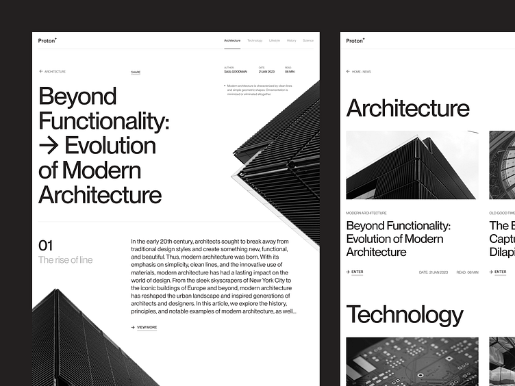
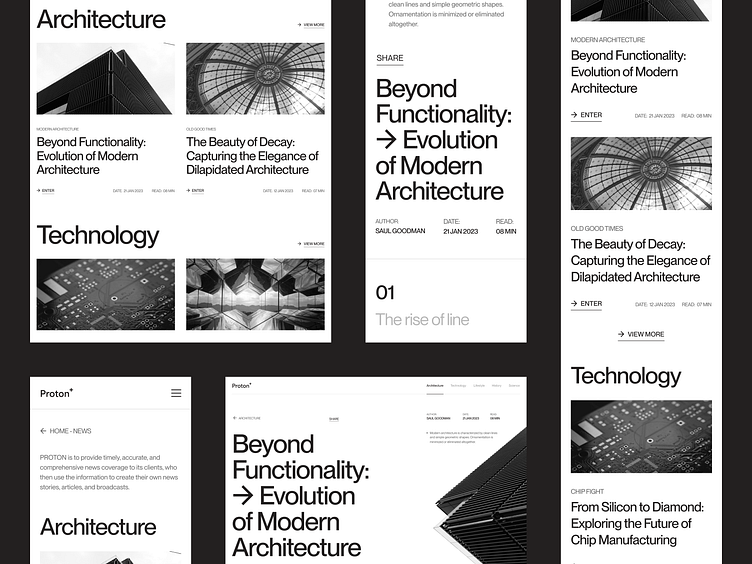
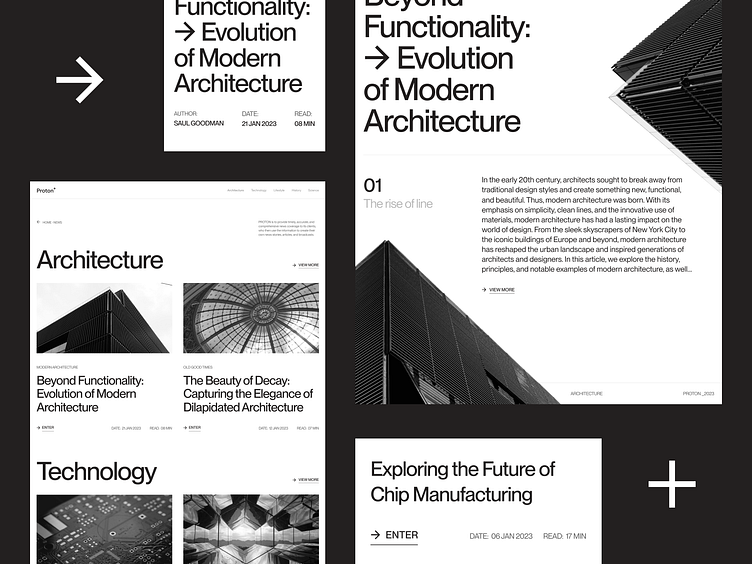
PROTON+ is an online magazine providing content on the following topics: architecture, technology, lifestyle, history and science. 🙌 PROTON+ aims to provide up-to-date, accurate and comprehensive news to its readers, who can use the available articles to create their own news, articles and broadcasts. 👌
Project concept:
The general design direction I have chosen is a strict and minimalist style.
Classic colors: black and white are to refer to printed newspapers, straight from American streets, where the main value was information and content. 📰
The large size of the headlines, the strict structure, the most important information - all this was only to boost the message that will be presented in the online magazine. For the project, I used a classic font - Neue Montreal, which by the way I love and recommend! 🫶
Let me know what you think about my concept design! ✌️
Hit "L" If you like it. ❤️
Would you like to implement a branding, website or a mobile application, but you do not know where to start?
💌 Write at biuro@visiontrust.pl and let us find your place in network space.
Enjoy and have a nice day! 🚀