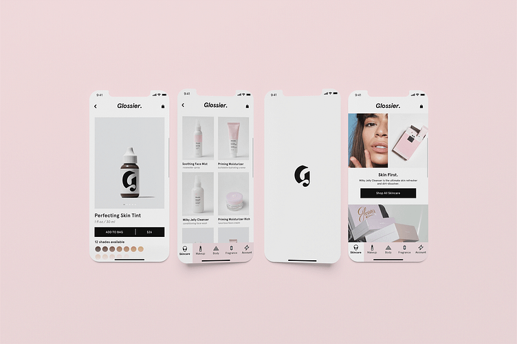
Glossier iOS app (case study)
Glossier Mobile App Concept Design: Bringing Beauty to Your Fingertips
Glossier is a beauty and skincare company founded in 2014 by Emily Weiss. The brand is known for its minimalist, no-makeup makeup aesthetic and emphasis on skincare. Glossier's products are designed to enhance natural beauty and promote healthy, glowing skin. The brand has a cult-like following and is popular among millennials and Gen Z consumers, who are drawn to the company's authentic and relatable marketing approach. Glossier has a strong online presence, with its products sold exclusively through its website and social media platforms. The company has expanded its product line to include fragrances, body care, and even a line of supplements. Glossier's commitment to inclusivity and diversity has also been a driving force behind its success, with the brand featuring models of all ages, races, and body types in its advertising campaigns.
As a designer, I have always been fascinated by the Glossier brand, its clean aesthetic, and its commitment to inclusivity. With this in mind, I decided to create a concept design for a Glossier mobile app, showcasing how the brand could expand its reach to an even broader audience. My mockups illustrate how the app would look and function, featuring a sleek, intuitive interface that makes it easy for users to browse products, make purchases, and access exclusive content.
Thank you for watching! 👀
For more contact me here: kristinavilyams@gmail.com
LINKEDIN: Kristina Vilyams
BEHANCE: Kristina Vilyams
INSTAGRAM: Kristina Vilyams


