UI Mobile

Project for the Banco Santander mobile application in its Spanish version.
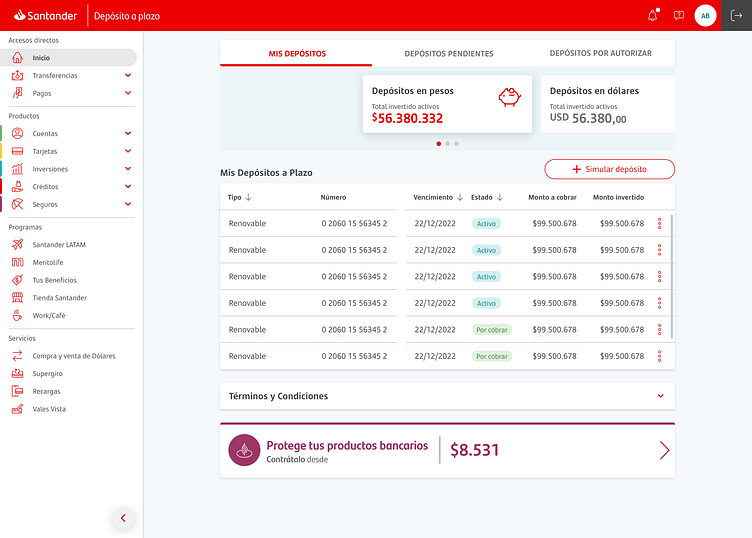
For the Investment area, we have created a sturdy data table using the mobile-first principle.
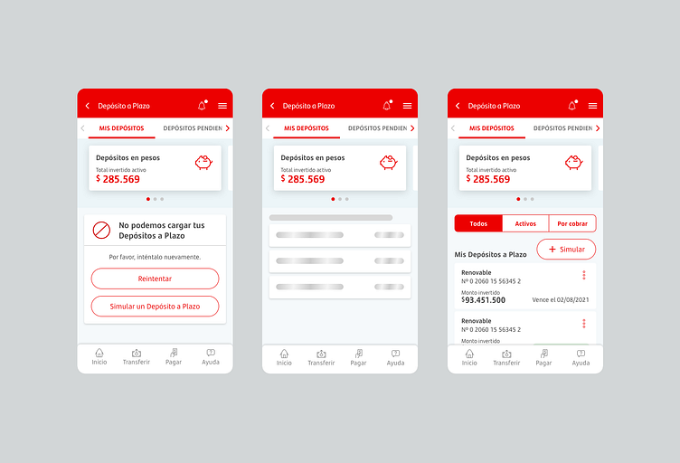
When viewed on a mobile device, the table is transformed into a box with two guiding columns that emphasize the most crucial data - the amount - making it easier to navigate.
The actions button, represented by three dots, is situated at the upper right side of the product name, providing it with hierarchy and visibility.
On desktop, the table contains six columns that are easily visible in this format. The amount, which is the primary data of the view, is positioned next to the actions button, located in the last column of the table, to highlight the action.