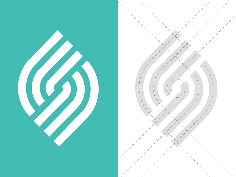
Modernist Design
After a deep dive into lettermarks and a modernist design approach, I've created a new symbol composed of clean lines that reflects simplicity and clarity. It's always difficult to work in this style as it's not unusual to fall into clichés or try ideas that have been done before.
Let me know what you think!
More by Santiago Barrionuevo View profile
Like
