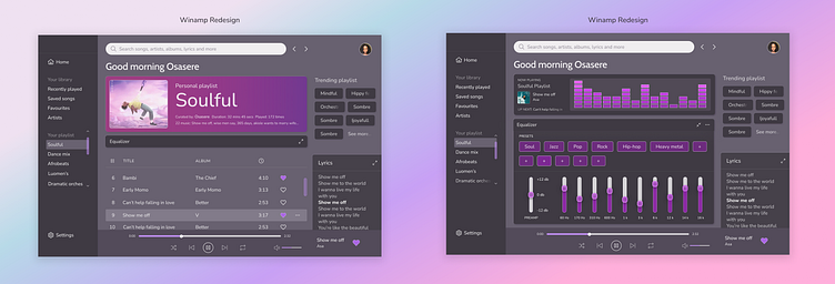
Winamp redesign
If you know the Winamp app, then you'll agree with me that a much needed redesign was necessary. I really wanted to retain the integrity of the design without changing much of its features because a major reason people loved using it was because of them. But, with advancement of sound tech and more, the equalizer feature seemed a bit obsolete. Ironically, it was also a major feature users loved on the app.
To preserve this feature, I came up with a solution of adding the expand icon option for users who still loved having this feature. This way, it didn't take centre stage in the interface, but it was present and could still standout if the user chooses.
What are your thoughts about this and the design?
Remember to smash "L" if you like this!
