QUAS branding
QUAS is a globally recognized market research, intelligence, and strategy consulting firm that offers bespoke solutions to clients across various industries. They help their clients to make informed decisions by providing deep insights and expert analysis of markets, competitors, and customer needs.
The goal
The goal was to create a brand identity that reflects QUAS’s expertise, credibility, and global presence. The branding needed to appeal to a wide range of clients, including businesses of all sizes, investors, and entrepreneurs. The brand identity should also convey the company’s commitment to providing tailored solutions that meet each client’s unique needs.
Old design
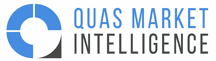
Before coming to us, Quas Intelligence had only some primary colors, a few fonts, and a logo. Below, you can see the logo they had before. Colors remained similar because of the psychological reason of blue.
New solution
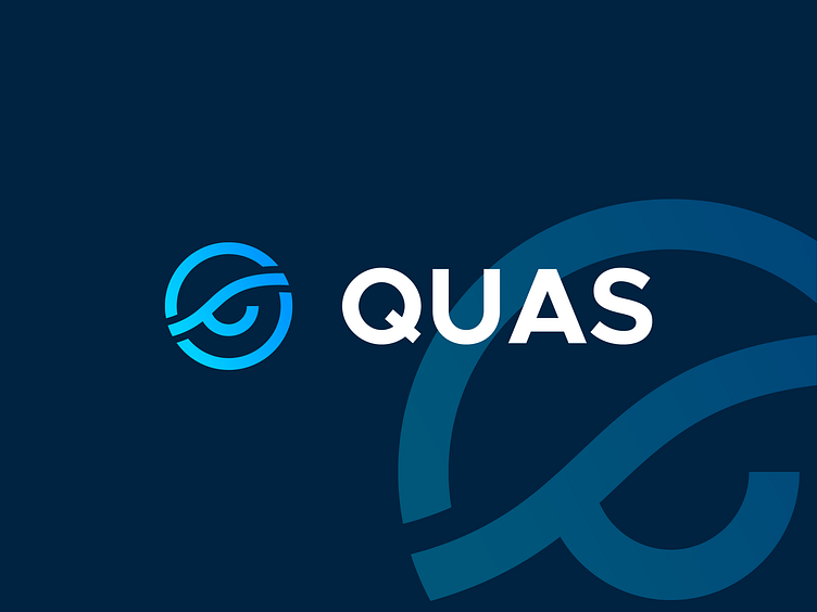
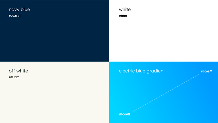
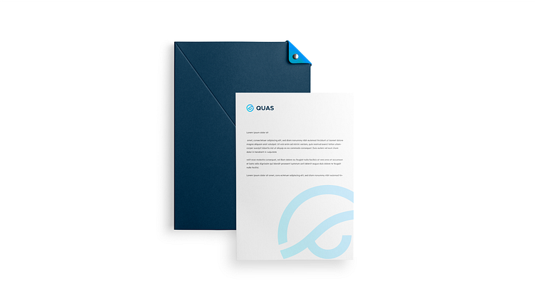
We started with the logotype to create a unique and recognizable brand identity for QUAS. The logotype is simple yet powerful; it combines an eagle eye in the center and a market around it to represent intelligence, victory, trust, professionalism, accuracy, and support. The color palette was chosen according to psychological insights. In color psychology, blue is linked with trustworthiness and reliability, while Navy blue represents trust and stability. In addition to the logotype, we designed a set of brand details that can be used across various media platforms.
To ensure consistency across all media platforms, we created social media materials that incorporate the new branding. These materials include profile pictures and cover photos that feature the new logotype and brand details.


Data
1 branding designer and 1 project manager worked on this project.
Adobe Cloud was used for design creation.
The design was completed in 1 month.