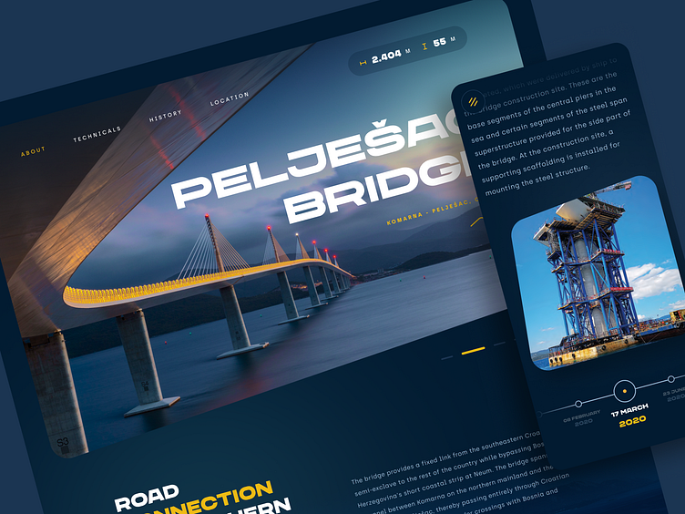
Pelješac bridge - landing page
Hello Dribbblers, Marko here!
This stunning new engineering marvel connects the Pelješac peninsula to the mainland of Croatia. The concept here represents a landing page designed to showcase this magnificent feat of construction, providing you with all the information you need to appreciate the bridge's beauty and importance.
The page features a large, high-resolution image of the bridge which is intended to capture visitors' attention. The color scheme is primarily blue with hints of white and yellow, which creates a sense of freshness and tranquility.
The page itself is highly intuitive, with a clear navigation menu, making the navigation fairly easy.
Don't forget to press "L" if you like it. 'till next time!
Tools used: Figma
Follow us: Instagram | LinkedIn | Facebook | TikTok
Get in touch with us: info@kickstage.com,
or find all of this info on kickstage.com!

