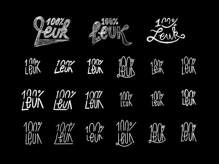
100% LEUK - Some sketch process
Sketch Process for "100% LEUK" Logomark
For the "100%LEUK" logo, the challenge was to create a mark that was both legible as "100%" and "LEUK". These two generic (dutch) words that freely translate to something like "100% FUN" prohibited the actual registration of the brand to go through, because they were too generic and therefore hard to copyright.
The solution?
I created a wordmark that did not actually say 100%, nor "LEUK", but by playing with typography i hinted at these words enough to make them read like it.
Before i landed on the winning design, i must have made like 50 different iterations of the lettering, exploring all sides and keeping it positive and lighthearted. A big process, but a really fun one to work on!
© Copyright Richard de Ruijter & 100% LEUK
