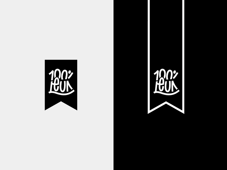
100% LEUK Logo
Logo Design for "100% LEUK"
For the "100%LEUK" logo, the challenge was to create a mark that was both legible as "100%" and "LEUK". These two generic (dutch) words that freely translate to something like "100% FUN" prohibited the actual registration of the brand to go through, because they were too generic and therefore hard to copyright.
The solution?
I created a wordmark that did not actually say 100%, nor "LEUK", but by playing with typography i hinted at these words enough to make them read like it.
Another thing, 100% LEUK words with people that usually have a hard time finding a job because of disabilities. The % mark also signifies as a kind person waving to the viewer. A 100% FUN project to have worked on!
© Copyright Richard de Ruijter & 100% LEUK
