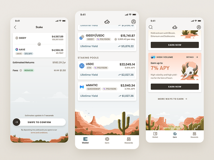
Desert scene screen anchors
Adding pops of illustration is a great way to add life to an interface.
“Software” can be very boring, especially financial software.
Over the past 10+ years mobile apps have made software more accessible to consumers. This has given software builders an opportunity to spice things up a bit. At Giddy we’re motivated to make our app delightful to use. We strive to pull our branding into various experiences in our app.
Crypto is the often compared to the “wild west”. There are a lot of unknowns about the future and it’s a wild ride. The wild west is a core element of our brand.
One way we add user delight is by pulling the wild west branding element into our app. We do this by adding desert oasis illustrations to the bottom different screens.
We usually put these illustrations at the very bottom of the scroll, as an anchor to the screen. This helps us avoid the mistake of allowing illustrations to clutter up the UI.
If you’re creating a consumer-facing interface you may want to consider this. Visual design enhances the user experience.
